What is accessible design for the web? How does it improve our business and fuel growth?
Nobody ever said, “Let’s build a website that over a billion of our potential customers can’t use.” However, that’s exactly what happens if your website isn’t designed for accessibility. Without internet-accessible design, you miss the opportunity to do business with the 53.2 million Americans aged 45 or older who have some form of visual impairment, and the nearly 10 million people who are hard of hearing. You also bypass the millions of people with a diverse range of neuro-motor, physical, and cognitive abilities. So exactly what is accessible design and how can it help?
Accessibility can also improve overall user experience and satisfaction for people without disabilities. Examples would include those in rural areas with low bandwidth or slow connections, older people with changing abilities, those with temporary disabilities, or those in an environment that reduces usability—such as areas that are dim or noisy.
Today’s assistive technologies—such as screen reading and voice recognition software—allow people with disabilities of all types to shop, socialize, educate themselves, and entertain themselves online. Now’s the moment to seize the opportunity to communicate, engage, and sell to people of all abilities.
The business case of improving website accessibility is strong.
The benefits of accessible design are multi-faceted, including:
Extending Market Reach:
The global market of people with disabilities has spending power of more than $6 trillion.
Strengthening SEO:
Google’s ranking algorithm is increasingly putting greater emphasis on accessibility.
https://www.ladybugz.com/your-must-have-monster-seo-checklist-for-2021/
Positive Branding:
Greater web accessibility improves and reinforces your commitment to diversity efforts.
Reduced Legal Risk:
Many countries legally require digital accessibility, and this movement is growing.
It’s time to break down the barriers to communication by designing websites with an intentional focus on increasing accessibility and enabling users to make the most of their assistive technologies.
What is accessible design and what does it mean?
So far we’ve been speaking in general terms about helping the differently-abled enjoy our digital assets. But, more specifically, what does that mean? Outside of the US, nearly two dozen countries have enacted laws or policies related to website accessibility. In the US, however, the ADA (American with Disabilities Act) has no specific mandate or regulations about website accessibility.
Whether or not a particular country has website accessibility regulations, though, companies are investing in diversity and inclusion efforts. Most realize that their websites must better reflect this commitment. The global standard-bearer for website accessibility is the World Wide Web Consortium (W3C) and its Web Content Accessibility Guidelines (WCAG). These are by far the most universal and popular guidelines.
WCAG design principles include:
Perceivable:
Users must be able to perceive all relevant information in the website’s content.
Operable:
Users must be able to operate the interface successfully.
Understandable:
Users must be able to understand the information and operation of the interface.
Robust:
Content must be accessible to all users and can be interpreted by a wider variety of user agents.
What design elements are important in website accessibility?
We know what accessibility is and why it’s important. The next question is how to create welcoming websites that provide a good experience for all visitors.
Below are suggestions in three key areas:
Accessible Navigation
Understandable Content
Easy-to-Complete Forms
What is Accessible Design Navigation?
Create keyboard-friendly content and functionality.
A variety of impairments, situations, and assistive technologies don’t allow for navigation with a mouse. Most assistive technology requires using the Tab key to move between regions. Accessible design calls for having a “keyboard focus,” with navigational elements that can be activated or manipulated with the keyboard. Primarily, this means ensuring that the users can use the Tab key to access all web content and navigational elements—including dropdowns, links, CTAs, widgets, buttons, and anchor-text.
Keyboard accessibility shortcuts can also make it easier for the visually impaired to navigate a site. For example, pressing the Windows logo key and the plus sign (+) can turn the magnifier on (Here’s a list of keyboard shortcuts for Windows 10). By adding simple keyboard commands, visitors can navigate using arrow keys and a few keystrokes, rather than chasing the cursor around the screen. For those with visual impairments—who often use screens that measure 20+ inches diagonally—these shortcuts help them avoid losing their place on the screen, moving their head and eyes too much, visually shifting focus, and experiencing eye strain.
Accessible Design in relation to Understandable Content
Make dynamic content “readable” for Accessible Design.
Assistive technologies were developed with the assumption that content is static. However, today’s interfaces feature more dynamic content that changes based on user preference, behaviors, and interests. These changes without the page reloading based on data and user interactions. The issue is that many screen readers will only “read” the page as it appears when it first loads, causing the software (and user) to miss the rest of the content. Additional scripting and semantics are required to inform assistive technologies when the content changes.
The main specification to resolve this problem is W3C’s WAI-ARIA (Web Accessibility Initiative-Additional Rich Internet Applications), a set of HTML attributes (roles, states, properties), and some best practices for scripting content to aid accessibility. These ARIA tags and “landmarks” help screen readers and similar devices navigate dynamic content by tagging it as a “live region.” According to WebAIM, proper ARIA usage can:
Enhance accessibility of interactive controls, such as tree menus, sliders, pop-ups, etc.
Define helpful landmarks for page structure
Define dynamically-updated “live regions”
Improve keyboard accessibility and interactivity
And much more.
A 2022 Plan to Improve your Blog Content and Turn it into Rocket Fuel
Give users control over automated media.
In addition to dynamic content, designers need to aware of potential accessibility and usability problems with automated media and navigation. For example, screen readers may not know how to turn the media off. In other cases, sudden noise can alarm certain users. Sometimes auto-advancing carousels/sliders don’t provide enough time to absorb the content.
One good piece of advice is to only use automated media if it’s in your audience’s best interest, not just because it’s cool or fun. Another is to put your visitors in control, giving them clear ways to start, pause, and end carousel movement, videos, sound, animations, or other media. Similar to the guidelines for dynamic content, all functionality should be operable by keyboard, slider changes must be communicated to users and assistive devices, and keyboard focus should be managed in a reasonable, comprehensive manner.
Create easily identifiable Interactive Elements for Accessible Design.
Interactive Elements:
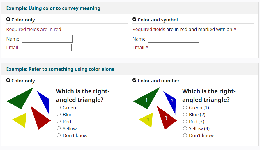
Another navigational consideration is interactivity and the ease of user engagement. This is important not only for those with disabilities, but for usability in general—especially on small screens. Links, buttons, and other interactive elements should be easy to identify, with consistent naming, styling, interactive feedback, and positioning used consistently across the site. Also, avoid color combinations (such as red and green) that are difficult for the more than 8% of the population with color blindness to distinguish between. Instead of conveying information through color alone, clarify elements using combinations of color, text, labels, and iconography in your interactive design.
![]()
Heighten the Contrast.
Color, texture, and contrast are huge considerations for any website, especially with considering accessibility. A high priority is choosing a color scheme with high contrast between text (foreground) and background. Retinitis Pigmentosa, Glaucoma, Retinopathy, and cataracts all lead to a decrease in contrast sensitivity. While an interface with subtle color gradations may be attractive, low contrast can cause strain and fatigue for people with visual impairments.
Provide options for consuming content.
Today’s website design trends often minimize written content in place of prominent, eye-catching images and multimedia content. Fortunately, those with disabilities don’t have to lose out on the information conveyed by these website features.
All it takes is accompanying photos and graphics with descriptive HTML “alt tags” for screen reading software (which is a snap in WordPress). Alt tags can also help with SEO, giving search engines more information to crawl and providing the opportunity to include keywords. For other media, you can include visible links to transcripts of audio, links to audio-described versions of videos, captions, and descriptions of tables and graphs.

Easy-to-Read Formatting for Accessible Design
It’s relatively simple to make pages easier to comprehend with just a few formatting and layout tips. These techniques are helpful for all of your website visitors, with or without visual impairment. By improving overall usability and user satisfaction, the tips below can even help with SEO—and all are well within the control of even non-technical marketers.
- Use easy-to-read fonts, such as Arial, Helvetica, Calibri, and other sans serif fonts that have simple, easily recognizable characters.
- Use large font sizes, with body type at least 16 points.
- Group content under descriptive subheadings.
- Fully write out acronyms on first-mention.
- Give all your links unique, descriptive names, and anchor text.
- Use plenty of white space.
- Reduce clutter.
- Only use tables for tabular data—not for layouts, lists, or anything else that could confuse assistive technologies and devices.
Easy-to-Complete Forms for Accessible Design
Many online forms are not designed with accessibility and assistive technologies in mind, which can be the source of great frustration—and a sure way to lose business.
Here are some guidelines to follow:
- Provide information and instructions that are clear and easy to understand.
- Give all fields elements or title attributes.
- Create error messages that are clear and labeled for screen readers.
- Clearly label each field, with the label in close proximity to its respective field, either to the left or above the field (checkboxes and radio buttons are usually on the right).
- Include text that indicates required fields.
- Provide feedback for interactions, such as error messages and submission confirmation. Important feedback that requires user information should be in a prominent style, such as those specified by W3 (the World Wide Web Consortium).
There are many form-builders and WordPress plugins designed for this purpose, including Formidable Forms, WP Accessibility Helper, and Accessibility WordPress Plugin.
Conclusion
Making sure your website is welcoming and accessible should be a top priority. It’s socially responsible, respectful, and simply good business! There’s no reason to exclude anybody, especially since it’s relatively easy to avoid doing so. Not only will your users thank you, but you’ll likely see increased traffic and conversions. To assure your website is optimized for accessibility, work with an interactive agency like Ladybugz Interactive that has expert knowledge about what is accessible design for the web.
