Is your website Homepage Doing its Job?
When visitors land on your homepage, you don’t have much time to engage them. More than half of visitors spend fewer than 15 seconds on your website—so little time to capture a visitor’s attention! As the focal point of your website, a poorly designed homepage can cost you leads, customers, and visibility.
Your top performing homepage serves a vital role in quickly directing people to where they want to go and encouraging them to go deeper. As your website’s centerpiece, the homepage is an important factor in bounce rate, session duration, and other website performance indicators.
Comprehensive planning will impact your homepage content and layout. It also sets the stage for all the internal pages of your site.
Here are 8 homepage design elements your team will need to consider to top performance and ROI:
1. Set Goals and Expectations for a Peak Performance.
The very first step is determining how your top performing homepage can best support your marketing and digital business goals. Its design and functionality should be founded on objectives such as reaching a specific audience, increasing leads, generating subscriptions, and promoting high-value core products.
Many businesses use the SMART framework (Specific, Measurable, Achievable, Realistic, and Time-bound) to effectively clarify goals. One example might include: Increasing subscriptions from your financial industry customers from your homepage CTA by “x” percent. Another might be: sending “x” users of product group “A” from the homepage to a specific product page. As an adjunct to SMART goals, build a methodology to measure, track, and analyze performance for future refinement.
2. Define your primary target audience.
Going back to the SMART framework discussed above, defining your audience is one aspect of setting your goals and expectations. You are not writing for everyone on the internet. You’re probably not writing for everyone in your industry. You will most likely focus on a smaller niche, and perhaps maybe a majority subset of that group.
Your top performing homepage should attract and start to create relationships with your high-value audience. Are you looking for new leads for your popular products, repeat business on high-end products, or branding within your industry? Depending on the broad description of this audience, what are their demographics, and why are they coming to your website? When it comes to design and content, most of your website focused on this audience—maybe 60-75%. However, you also have to consider your other audiences. No matter who you are writing for, make quality your top priority.
3. Dig into your audience’s preferences and expectations.
Now that you’ve defined your audience, you’ll want to identify ways to attract and engage them on your top performing homepage. As you start planning, think deeply about what they will expect when they land on your website homepage—and the best way to welcome them to your digital home. In addition to demographics, consider how they consume content, their intent, the devices they use, and other factors.
Let’s look at an example of two businesses that want to build a new website: a nail salon and a software company. This chart breaks down these businesses’ key audiences using several factors.
| Attribute | Nail Salon (B2C) | Software Company (B2B) |
| Demographics | Females 20-40 years old | 30-55; end-users; business/product managers |
| Intent | Set up appointments | Research benefits of services; content |
| Income | $75,000 | $125,000 |
| Decision-Maker | Yes | No |
| Device | Mobile | Desktop |
Clearly, these businesses’ homepages will be totally different based on who their audience is and the purpose of their visit. As the chart above shows, you can’t build a successful home page without a firm grasp of what your audience expects and needs.
4. Put function over form for your top performing homepage.
As visual beings, it’s natural for us to start homepage design by thinking about what the site will look like. For many people, this is the fun part, with other aspects playing second fiddle. Yes, the right look is critical for the no-fail homepage, but functionality needs to come first, based on your audience’s needs and your company’s objectives.
As marketers, we need to think about the “look and feel” in relation to our business goals, audiences, and what we’re specifically trying to achieve. This includes appealing to our readers’ aesthetic tastes to make a meaningful first impression. But what about after that? If they don’t instantly bounce away, they will quickly determine (usually in less than 30 seconds) if the site is relevant to them and if they can find what they need. We need to immediately engage them and start them on a path to interacting with the site. That engagement is of the utmost importance, so it must be the focus of planning the homepage.
5. Create intuitive navigation.
Now that you know your goals and understand your audience, it’s time to think about their journey on your website. Like many aspects of planning your website, this requires is a two-pronged approach: First, your audience wants to access valuable information—quickly and easily. Second, your company wants to guide visitors to your high-value pages (but never at the expense of the visitor’s needs and user experience).
Organize your main navigation bar and any dropdowns logically. Think about how your visitors will likely use your site, and potential paths to purchase. In addition to navbars, think about other links to your inside pages, such as hyperlinks and CTAs.
6. Design the homepage to look like a homepage.
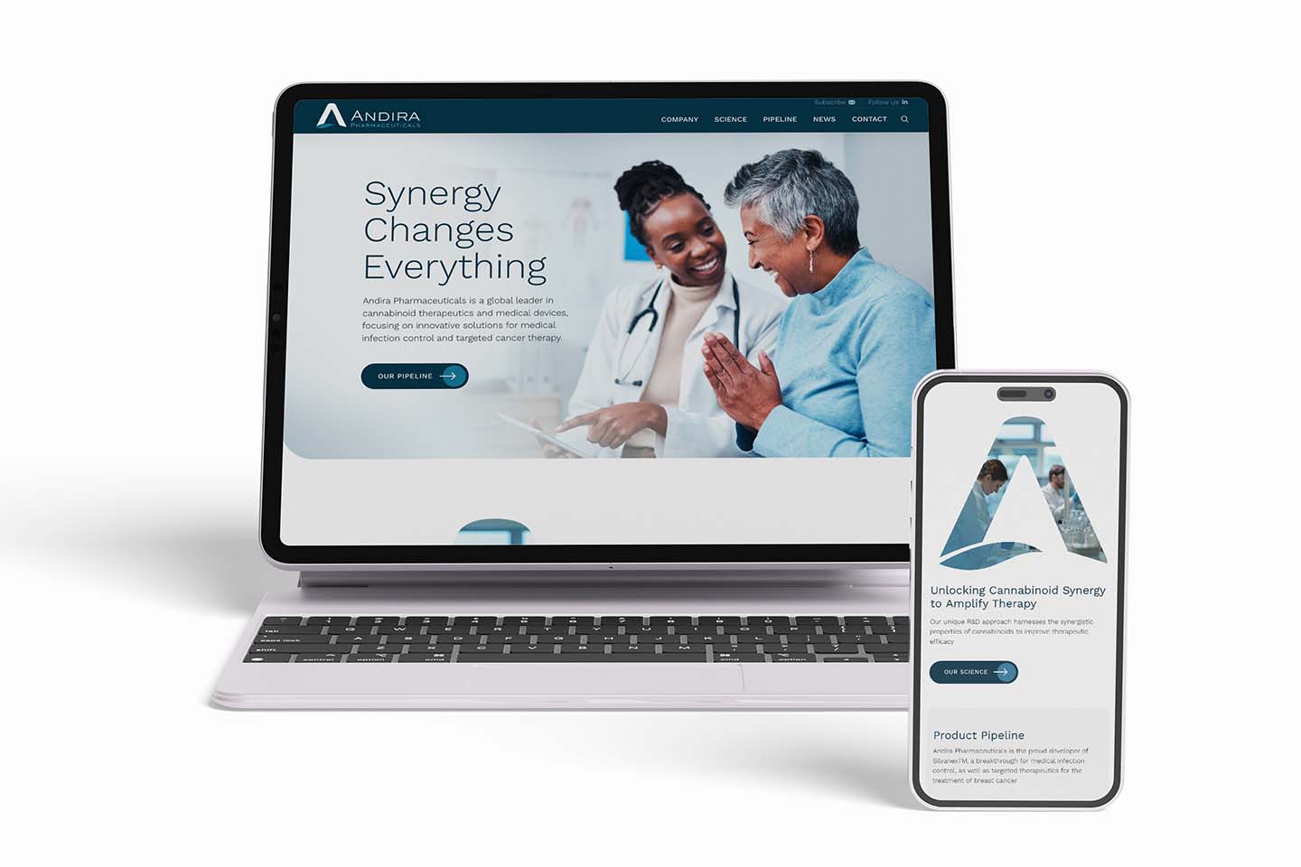
People have certain expectations of what a home page looks like. The first element is usually a large, message-oriented masthead or banner across the top of the page (more on that below). Next, the visitor expects a clear, well-organized navigation menu. Your viewers will want to get a clear, simple message—so don’t overload the homepage with too much copy or multiple “special” CTAs (many of which are more appropriate for your inside pages). Overall, your new no-fail homepage should entice readers to come on in, not demand anything from them,
7. Create a powerful “hero” banner for a top performing homepage.
While we’re talking about design, less move onto the most impactful graphic area of the homepage—the hero image. This refers to the large web banner that is generally the width of the entire site located at the top of the homepage. Most homepages include a prominent hero, but one caveat is that they can slow load time—which you can check out during the building phase.
The hero image usually consists of several elements:
- Primary Graphical Element: This visual image will be the first glimpse of your company. Hero images often feature people to build a sense of connection. Other images focus on the company’s value proposition, an emotional response, or industry-relevant graphics. Static images are the most common, but video and animation are increasingly popular.
- The headline. According to advertising master David Ogilvy, five times as many people read the headline as the body copy. And they’ll leave quickly if not immediately interested. So these five-10 words are crucial. Take your time and carefully weigh many different options.
Popular types of heading convey one or more of the following:
- Audience pain points
- The company’s USP (unique value proposition)
- Primary benefits to the audience
- The quality of your brand
- A visionary statement
Many mastheads (but not all) include a complementary subheading that supports the main heading and adds a way to draw people in. Often subheads are a bit longer than the main headline and appear in a smaller font.
8. A homepage should provide the right amount and types of information.
There’s a balance between providing too little and too much information on the homepage. Too little may not give them confidence in your website and encourage engagement. Too much may overwhelm them. There are different types and uses of “information.”
I break this down into three basic categories:
- Branding information: Use your homepage to cohesively define your brand identity, starting with a visible logo—and maybe a tagline or slogan. Common locations are in the upper left or as a central feature of the hero banner. You might see additional branding in the footer and other locations that appear on every page. Use a brand-related color palette, fonts, and other design elements, all of which will be carried throughout the entire site.
- Descriptive Information: Be succinct with verbiage. Longer pages have become more common, but people do eventually get sick of scrolling. Stick to your main message and focus on drawing them in, engaging them, and making them curious.
- Navigational Information: Your main menu, hyperlinks, CTAs, and even the sitemap on your footer are “information” designed to give quick access to areas that are valuable to your visitors.
Make your top-performing homepage serve its purpose.
Your homepage is the gateway to your website. It creates your first impression, helps Google define your place in the internet universe, and guides your visitors along their user journey. When building or updating your website, remember that your new no-fail homepage is a unique page in your website, with its own special purpose. When partnering with a digital agency, collaborate with them to give your homepage the attention it deserves.

