Featuring our agency’s best biotech website design examples
Our biotech web design agency presents the best biotech website designs we have created over the last year. Our agency designs websites for startup and early-growth companies in the biotechnology industry, including drug discovery, therapeutics, genomics, cell therapy, biotech AI, CROs, and bioinformatics.
Here are examples of the most recent biotech websites we designed
Can your biotech website design hold your audience’s attention? Two facts tell us how hard it is. Biotechnology is a highly competitive market with an expected annual growth rate of 15.83% from 2021 to 2028.
The bottom line question is, can your biotech website design hold its own in a booming life sciences industry?
When you are a startup or early-growth biotech company, this is even more important as the eyes of investors, investigators, and future teams make decisions about your company.
We’ll examine the best biotech website designs we’ve created for early-growth and startup biotech companies in Boston, Cambridge, Research Triangle Park, North Carolina, San Diego, San Francisco, Miami, and Houston.
First, let’s examine what goes into creating an award-winning biotech website for an emerging life sciences company.
Related Reading:
Biotech Website Design: What are your objectives?
Before jumping into the portfolio of award-winning biotech websites we designed, let’s start with a framework of what any biotech website homepage should accomplish:
- Your biotech website design should create the right first impression for investors and investigators.
- Provide valuable, high-quality messaging and content to your key audience segments.
- Effectively and quickly drive visitors to pages that matter to them.
- Reinforce your biotech company’s brand through visual and written content.
Related Reading:
Launching a startup biotech website: A complete guide from Seed to Series A
Meet the Best Biotech Website Designs Built by our Web Design Agency
Our life sciences-focused marketing agency has onboarded over 50 new biotech website design clients in the last two years, making us one of the country’s fastest-growing and most successful biotech web design agencies. We are experts at small biotech projects and biotechs requiring a go-to-market digital strategy.
We specialize in biotech logo design and branding, messaging, website photography, website design, biotech SEO, digital marketing, and hosting and support.
We learned the struggles in early growth biotech website design projects. We created our agency to work with our clients in an agile and collaborative process so biotech companies can go to market with a launch and grow with our agency. We are your full-service biotech web design agency.
Meet our biotech website design clients and the beautiful websites we have designed for them. Also, you can read any of our best biotech website reviews on our Clutch.co profile
Our Best Biotech Website Design Work Examples for 2025
1. Biotech web design for growing startup company located in Atlanta
The Biotech Company: Axion Biosystems
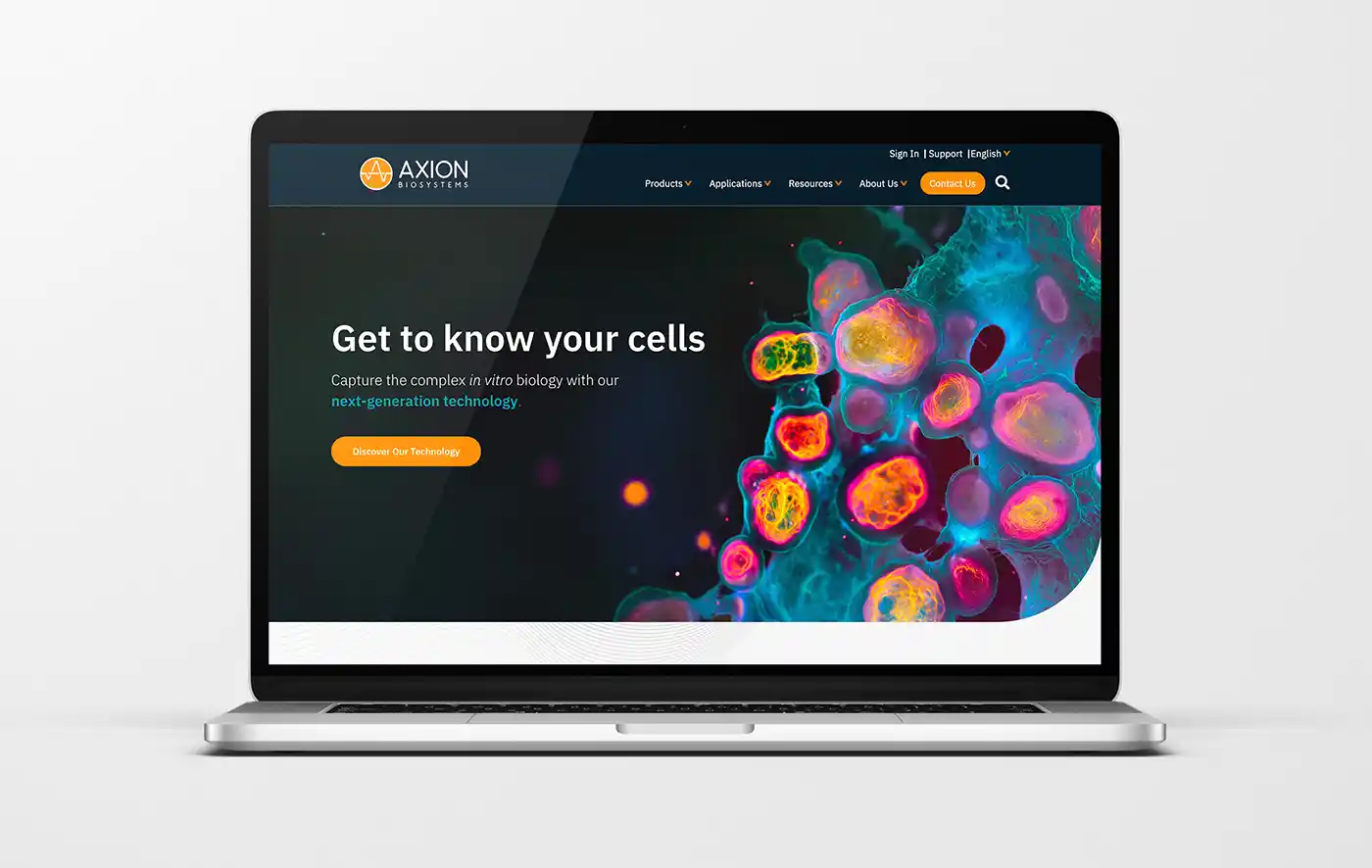
Axion Biosystems provides unprecedented access to human biology to advance disease research and therapeutic discovery. They started as a small company with a core product line that grew and established itself in the market. Today, Axion Biosystems continues to grow in product offerings and additional product lines.
The Takeaway:
Axion Biosystems chose Ladybugz as their creative web partner to help reimagine their website but not redesign the entire site. In collaboration, our agile growth sprint was perfect to elevate the messaging and design and develop that onto their current Drupal platform.
The Details:
Axion Biosystems approached Ladybugz, with the goal of introducing its diverse product lines and technology, reflecting the excitement around what it means for researchers. Our agency worked closely with the Axion creative team to deliver a website homepage that uses effective messaging, and a careful user-experience design mixed with bright, bold colors.
Biotech Website Reimagined:
We worked with the Axion team to review the overall structure and flow, with feedback on emphasizing applications over products. Our design team used bright and dark colors and carefully targeted messaging around the products and services as you scroll through the new homepage.
Together, we worked on incorporating more biology-focused messaging, and making the featured content section more flexible to highlight different types of content.
Visit the website design case study for Axion Biosystems to learn more.
2. Biopharma web design for a biopharmaceutical cannabinoid company based in Vancouver, Canada
The Biotech Company: Andira Pharmaceuticals
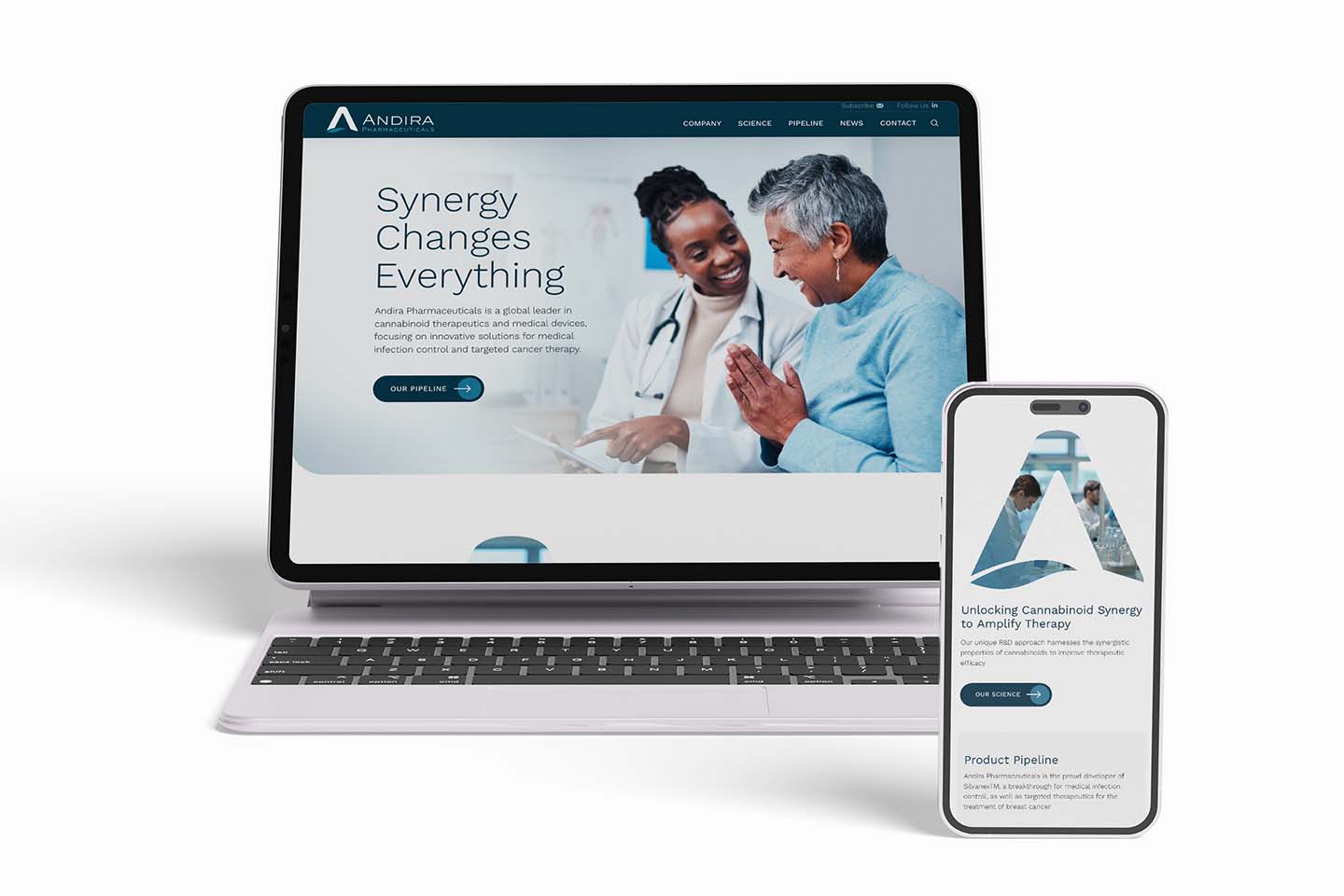
Andira Pharmaceuticals provides innovative cannabinoid therapeutics for medical infection control and cancer. Their breakthrough cannabinoid therapeutics focus on medical infection control and the treatment of breast cancer and breast cancer pain.
The Takeaway:
The biopharmaceutical sprint website redesign that Ladybugz did in collaboration with the Andira Pharmaceuticals team was completed in 10 days. The updated website has a look and feel better represents their breakthrough cannabinoid therapeutics and innovations.
The Details:
Andira Pharmaceuticals approached Ladybugz, needing help updating their biopharmaceutical website quickly before an important event. They hired Ladybugz for a biopharma website redesign, including updated bold imagery and graphics and an elevated logo design and color palette.
A Bold New Look in Only 10 Days:
Ladybugz Interactive always puts their client’s needs first. Andira expressed early on the importance of launching their website redesign before their essential event occurred. Our team ensured we could deliver on such a highly expedited timeline. Both teams worked seamlessly together to complete the job, with tight deadlines. Andira’s 10-day website redesign was one of the fastest in Ladybugz’s history, and we are proud to have exceeded their goals.
3. Website design for a biotech immunology startup in New York
The Biotech Company: Tharrimune, Inc.
Tharimmune, Inc., is a clinical-stage biotechnology company based in New York seeking to stand out in the rapidly changing and highly competitive immunology space.
The Takeaway:
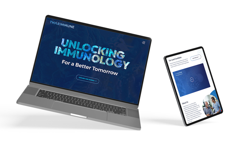
The Tharimmune team required a website highlighting its portfolio of therapeutic candidates for inflammation and immunology. The website must also clearly illustrate how its technology could change patients’ lives. Therefore, the company required a bold visual design to bring these messages to the right audiences.
The Details:
Our expert biotech team customized the website redesign experience to fit Tharimmune’s pace, needs, and expectations. The team provided creative ideas but also let their content lead the process. Together, Ladybugz and Tharimmune landed on a new website that checked all the boxes.
The new biotech website uses dramatic, creative design, colors, imagery, shapes, and contrast to capture attention and intrigue investors and investigators to learn more. It provides clear and concise messaging and visuals that explain the potential of Tharimmune’s technology to improve patients’ lives. Lastly, it provides a visual and content-led format that educates and excites the audience about the better tomorrow they are working to create.
Visit the website design case study for Tharimmune to learn more.
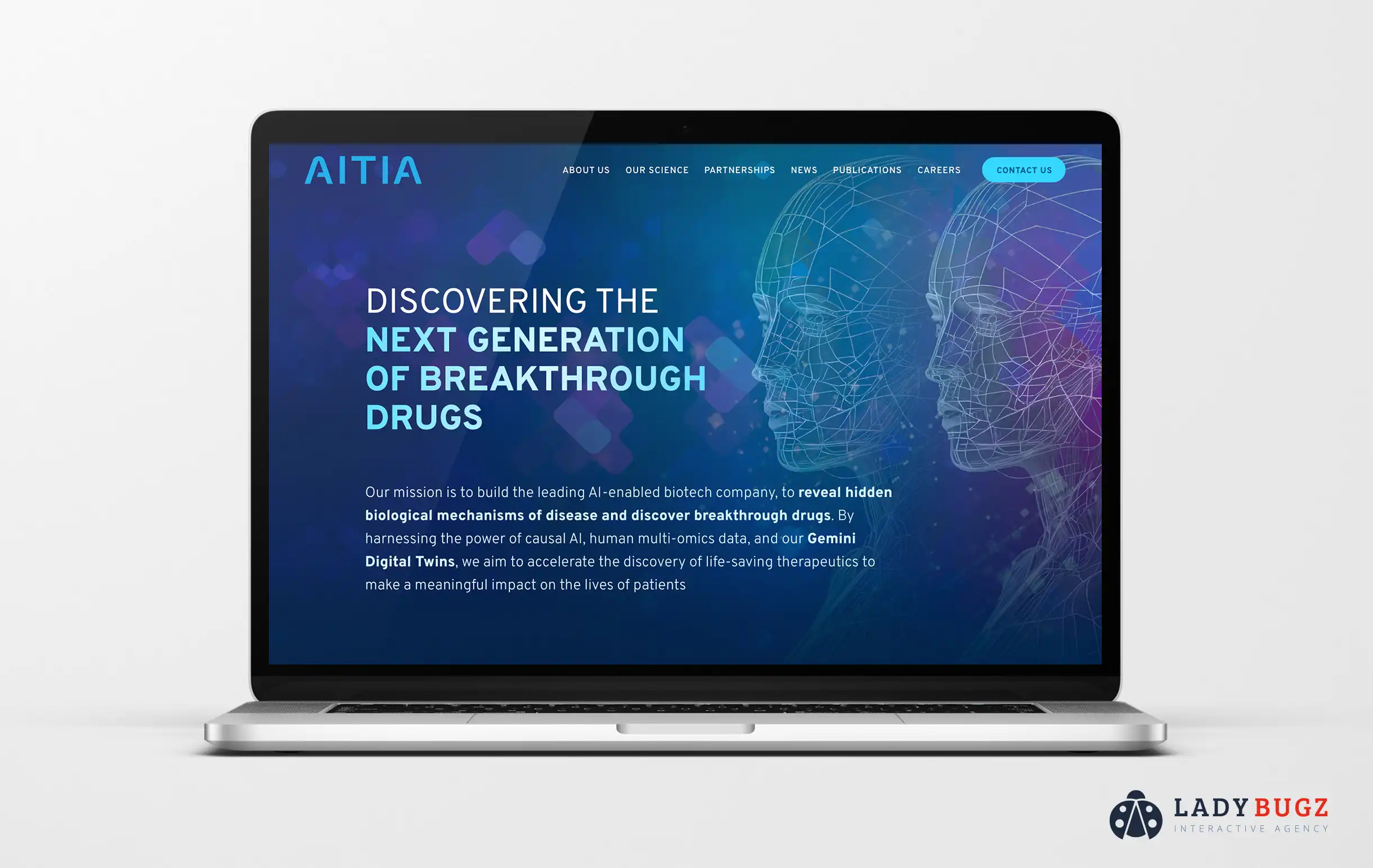
4. Website design for an AI-enabled biotech company
The Biotech Company: Aitia
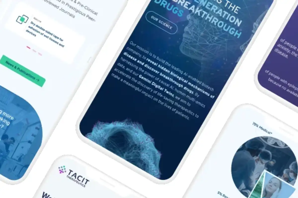
A Somerville, Massachusetts biotech company uses the power of AI to reveal hidden biological mechanisms of disease and discover breakthrough drugs. They approached our digital agency to build a new custom WordPress website that reflects their recent shift from purely biotech to AI-enabled drug discovery.
The Takeaway:
Aitia needed its new website to showcase its science and growing pipeline and attract partners and investors. It also wanted to showcase its rich company culture to prospective employees. Aitia was flexible when it came to design, but it definitely wanted to include a visual representation of its use of Gemini Digital Twins.
The Details:
Our designer and content manager worked closely with multiple members of the Aitia team who specialized in the different core aspects of the business to understand how best to portray them cohesively.
Our agile process aligned with the compressed timeline that the Aitia team required without sacrificing any of the thorough attention to detail that our clients have come to expect from our digital agency. The result is a visually stunning custom WordPress website that can evolve with this growing company.
Visit the website design case study for Aitia to learn more.
5. Bold website design for a startup oncology company
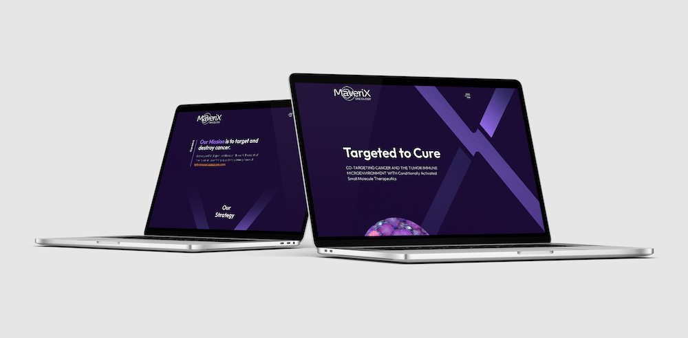
The Biotech Company: MaveriX Oncology
A biotechnology company based in Palo Alto, California was referred to our expert digital agency by another California-based biotech company who loved their website design created by us. MaveriX Oncology was in need of a biotech website design that could introduce their novel targeted therapeutics to the world and position their technology for success in a crowded immuno-oncology marketplace.
The Takeaway:
After feeling fatigued from their first failed website launch with another agency, MaveriX Oncology needed someone they could trust. They need a clean, crisp, bold website that effectively positions and communicates their technology clearly. Their goal was to capture the attention of new investors and partners and introduce their technology industry-wide.
The Details:
Our design team worked with MaveriX to create a bold and bright color palette contrasted with a dark background for a dramatic effect to stand out in the stale and color-muted biotech marketplace. Our content team worked 1:1 with the CEO to create clear messaging that explained their technology and its benefits.
Our agile process aligned with the tailored experience we created for MaveriX to fit their pace, needs, and desires. The result is a bold biotech website design that embodies their “maverick mindset” and bold vision to cure cancer.
Visit the website design case study for MaveriX Oncology to learn more.
Our Best Biotech Website Design Work Examples for 2023
1. Website redesign for a biotech bioinformatics company
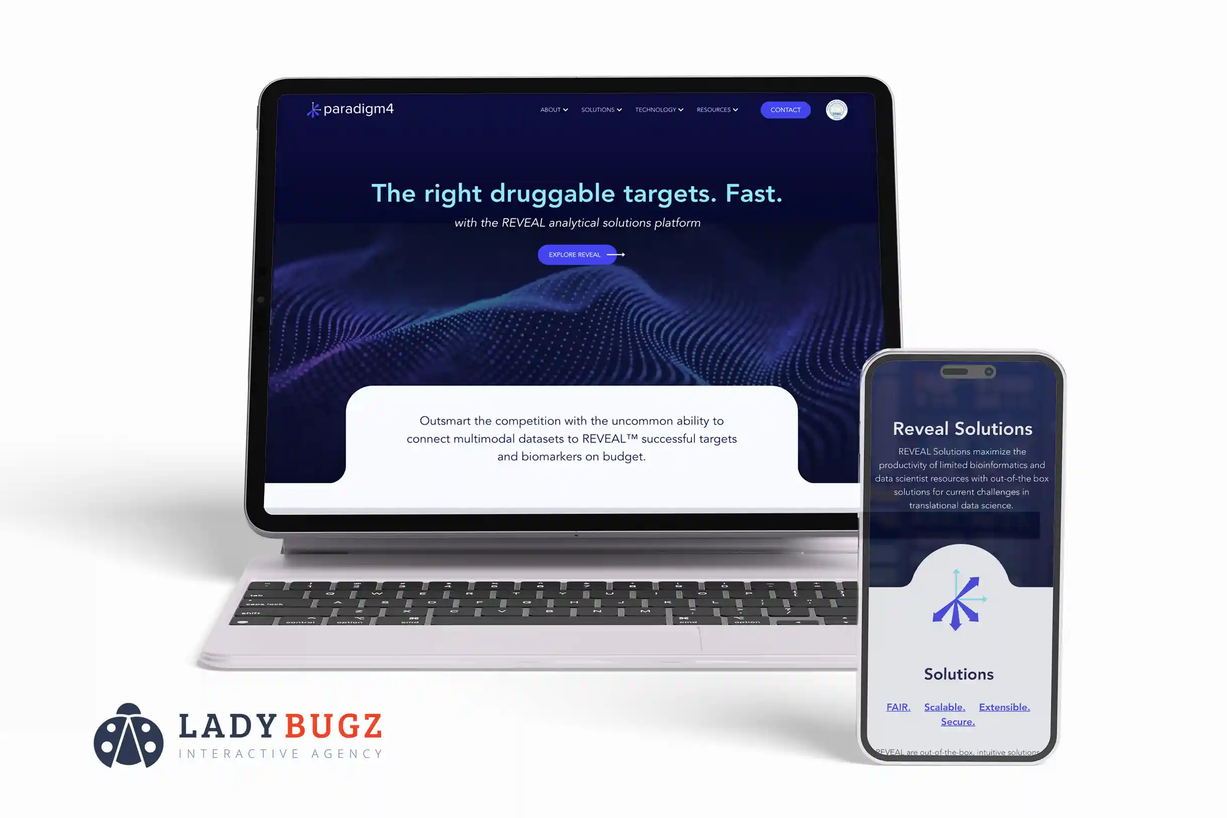
The Biotech Company: Paradigm4
A Waltham, Massachusetts-based bioinformatics company that specializes in scientific data management and computing optimization. Paradigm4 offers custom, scalable solutions to biotech and pharmaceutical companies, research organizations, and beyond.
The Takeaway:
Paradigm4 needed to address three main aspects of its current website: aesthetics, messaging, and search engine optimization. Their existing website lacked structure and was not attracting clients or highlighting their value proposition sufficiently.
The Details:
The team content manager worked closely with Paradigm4 for weeks and conducted industry research to craft a message that conveyed their expertise but remained easy for potential clients to understand. She also worked closely with executives on the Paradigm4 team to improve their search engine optimization results.
Our agile process allowed our designer, content manager, and client to work closely together to iterate the new website perfectly. The result is a website that conveys complex information concisely and beautifully.
Visit the website design case study for Paradigm4 to learn more.
2. Disruptive website design for a preclinical biotech company
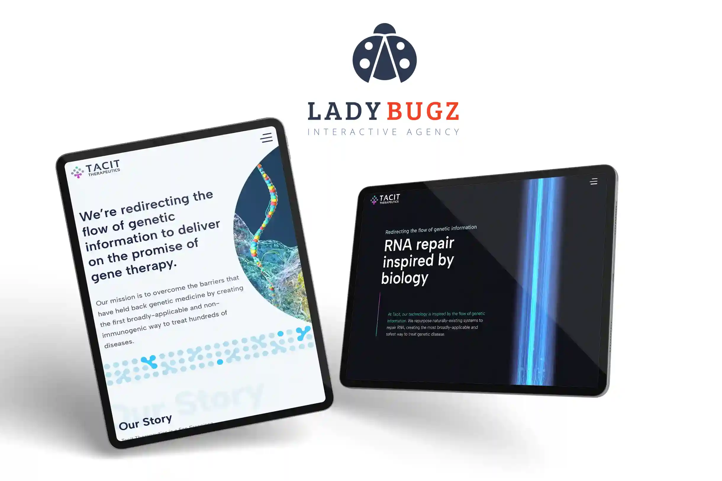
The Biotech Company: Tacit Therapeutics
Tacit Therapeutics is a San Francisco biotechnology company developing RNA-targeting treatments for devastating diseases. By repurposing preexisting components of human cells, Tacit Therapeutics has created the first broadly applicable and inherently non-immunogenic means of repairing mutated genes.
The Takeaway:
Tacit Therapeutics needed a disruptive biotechnology website design that would make a splash in a saturated marketplace visually with bold and bright colors and through hard-hitting, clear messaging that could communicate the problem they hope to solve with their biotechnology.
The Details:
Our team worked with Tacit Therapeutics to understand the company’s goals and challenges so we could create an emerging biotechnology website customized to fit its needs. The new website highlights the details of Tacit Therapeutics’ next-generation RNA gene therapy and Splicing-Directed RepairTM technology.
The biotech website achieves this first by using infographics, bold imagery, and colors that disrupt and intrigue visitors to learn more. Secondly, it is easy to consume and understand content that is equally enticing to explain their science and innovation. Lastly, a visual and content-led format that clearly states the problem, solution, and desired action steps.
Visit the website design case study for Tacit Therapeutics to learn more.
3. Biotech website design for a clinical-stage pharmaceutical company
The Biotech Company: NeuroPro
NeuroPro is a clinical-stage pharmaceutical company located in Research Triangle Park, North Carolina, which is actively developing proprietary compounds to treat neurological diseases, including epilepsy.
The Takeaway:
NeuroPro needed a new logo, brand messaging, and website to highlight its advances as a clinical-stage pharmaceutical company. The website needed to target clinical trial providers, the science community, and investors. Starting from ground zero with no digital presence was a great opportunity for the company to develop a unique brand and voice to promote its advances in treating neurologic diseases, including epilepsy.
The Details:
Our biotech branding experts started working on the logo and brand design for NeuroPro. The biotech company was inspired by images of neurological pathways and wanted to implement those images into the logo and, eventually, the website.
The result is a unique, custom biotech website with exciting new branding and modern design. The site successfully targets its three audiences—investors, providers, and scientists—with simple messaging and content. The animation throughout the website is a fun, unique experience that will keep users intrigued!

4. Biotech website design for a San Francisco drug discovery startup
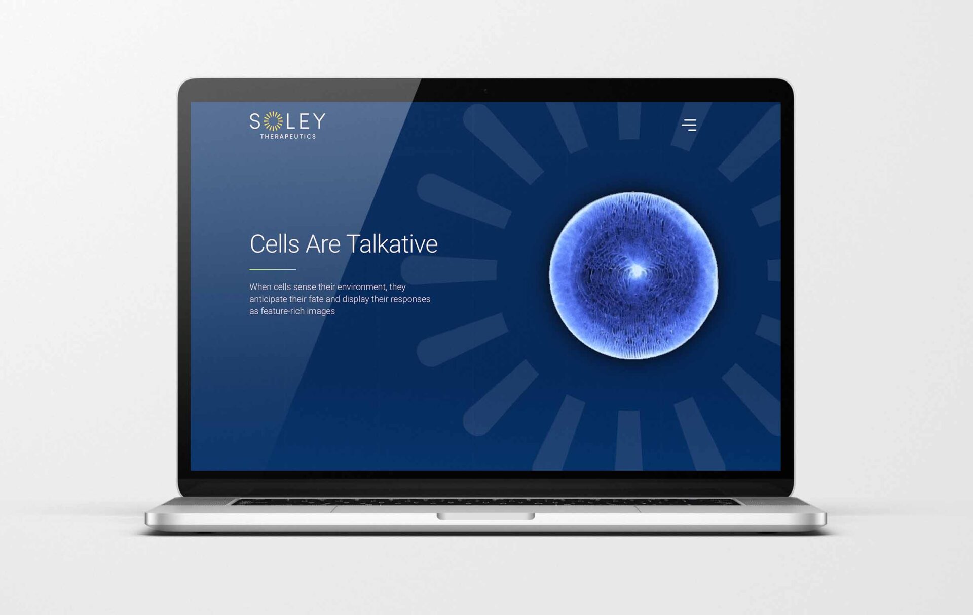
The Biotech Company: Soley Therapeutics
Soley Therapeutics is a drug discovery startup in San Francisco whose groundbreaking high-throughput platform technology uses the cell as a natural sensor. It harnesses cells’ anticipatory biological capabilities and utilizes the power of AI/ML to discover and develop drugs efficiently and effectively.
The Takeaway:
Soley was coming out of stealth mode and needed to promote their drug discovery technology. The biotech startup had tried to launch something the year before but was unsuccessful as the company was not ready to come out of stealth. A year later, as the company grew, it was ready to start. Soley Therapeutics realized it needed to work on its logo and branding before tackling a new website. The company realized it would need brand messaging and storytelling to clearly explain their drug discovery platform. The Soley team required a full-service digital agency that could tackle all of the aforementioned needs.
The Details:
Our biotech branding experts got started working on the logo and brand design for Soley Therapeutics. The company had a logo they had started and had some ideas, but it needed to be evolved to create the impact the client wanted it to have. Soley is named for “Soleil” in French, meaning sun. The company wanted to implement that meaning into its logo. Our team went through a six-week process with the biotech to create something to help them bring their vision to life.
Next, we helped the drug discovery startup with the messaging and design for its new go-to-market website. Clear, concise, yet catchy language invites the website audience to want to learn more. The website’s messaging and design tell a story, which was Soley’s goal. The company’s founders wanted to excite the community about their new drug discovery platform.
The Client Feedback:
“We were very pleased with the website. Ladybugz delivered items on time and was flexible with timing to meet our needs. We had some stops/starts on our end that Ladybugz was able to accommodate. A combination of web meetings, emails, and file sharing worked well. They had a flexible work style, creative culture, and individualism, the ability to buy into our culture and get excited about our project, and professionalism.”
5. Website design for a local Massachusetts biotech startup
The Biotech Company: Sanaheal
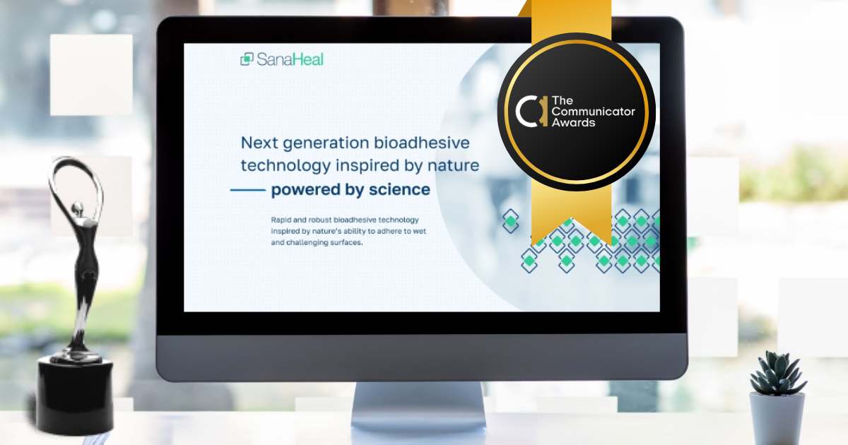
SanaHeal is a pre-clinical biotechnology startup whose team of scientists and engineers is developing a next-generation bioadhesive technology. This biocompatible product can be applied to wet, contaminated, and uneven surfaces in diverse form factors to control bleeding. The company was supported by The Engine The Engine invests in remarkable founders to create positive global change, and those are the founders we love to work with.
The Takeaway:
Sanaheal has created a new product on the market and wanted to go to market with the right messaging and website. Their old website was not built professionally. The start-up required a biotech website design agency to help them tell their story with clear and concise messaging and stunning design to explain the technology and its potential. The company also wanted to stand out to its audience of scientists, medical professionals, and investors and required a collaborative effort with an expert biotech website design and launch agency.
The Details:
Our biotech digital experts quickly got to work with the client. Our biotech digital expertise included bringing in a team for branding and messaging, visual design, animation, web development, and photography to build the perfect website for Sanaheal. Our process was collaborative and fast. Immediately the client and biotech team got to work. We used an agile process and our writer and designer worked hard to mesh design and messaging processes for an impactful user experience.
To uplevel the project, the team decided it needed to humanize the company’s digital presence. Sanaheal trusted our team to create visuals for the website with custom photography. The end result was a beautiful, impactful biotech website that speaks to the right audiences for Sanaheal. It tells their story and the potential of their product. We continue to work with Sanaheal as they grow, and we look forward to this product improving the lives of other humans.
2024 Communicator Award of Distinction:
Our digital agency is honored to be a part of an exciting award given to Sanaheal for their biotech website design. We were awarded with the 2024 Communicator Award of Distinction for biotechnology websites. The Communicator Awards have recognized excellence, effectiveness, and innovation across all areas of communication, as the leading international awards program honoring talent in such a competitive space.
6. Website design for expanding global genomics biotech in San Diego
The Biotech Company: Genome Insight
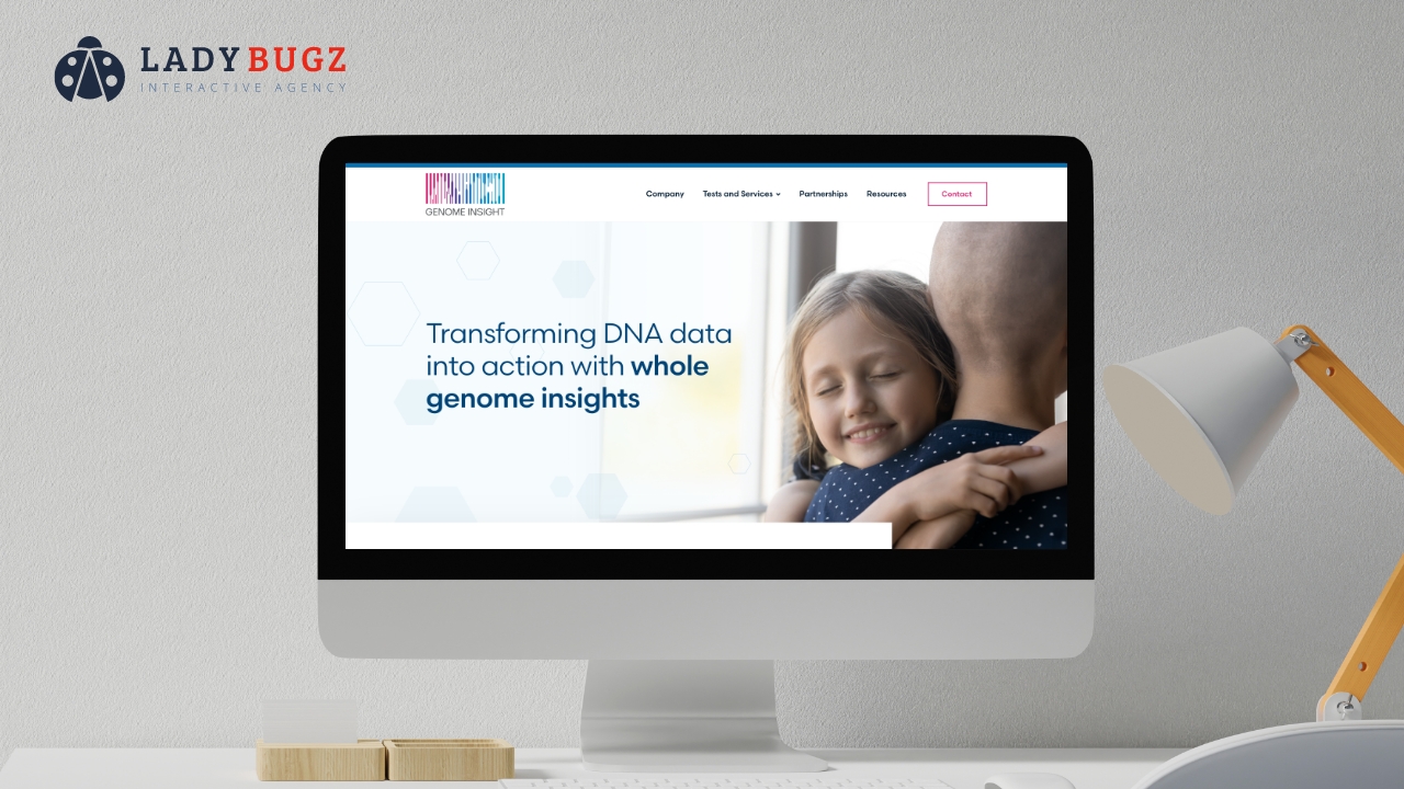
Genome Insight is a Korean global biotech company revolutionizing healthcare through comprehensive genome profiling and personalized patient care with its unparalleled whole-genome bioinformatics platform. The platform merges whole-genome and patient data with advanced AI bioinformatics, enabling first-in-class research and discovery, precision diagnostics and treatments, and personalized Fit-for-It solutions.
The Takeaway:
The team at Genome Insight was looking to relaunch a new website to speak to its global market. The company expanded operations to San Diego and wanted to showcase its worldwide presence with offices in Korea, Hong Kong, and the United States. The genomics bioinformatics company needed to speak to its three key audiences: patients, providers, and partners. Along with that need, Genome Insight also wanted to showcase its three platform products to each of those audiences. The biotech company realized this would be a challenge and sought an agency with strong messaging and UX design chops. Genome Insight chose the experienced biotech digital team at Ladybugz Interactive to help them move forward in the next stage of their global growth.
The Details:
Our biotech content team and user-experience designer quickly met the client to flesh out their needs and goals. Our team used our signature “agile process” to implement content and messaging while designing the website. The intention to speak to three different audiences and promote three different platforms was a challenging feat, but our team and the team at Genome Insight architected a beautiful site together that captured that goal. The site also features animation to explain the platform and beautifully designed graphics to guide users from different areas of the site. It was a bonus that Genome Insight already had a beautifully designed logo with colors we could use to enhance the biotech website design.
The global expansion included a fully translated website into Korean so that Genome Insight could reach its global market, namely Korea, and expand into the US.
The Client Feedback:
“We were very happy with Ladybugz Interactive Agency’s work. The new site was delivered on time and had all of the requested features and pages; we were pleased with the design as well. The team established a seamless workflow through prompt customer service — they were very responsive throughout the process. They also boasted a personable attitude.”
7. Biotech website design and agile process for CTDMO in Miami, FL
The Biotech Company: OrganaBio
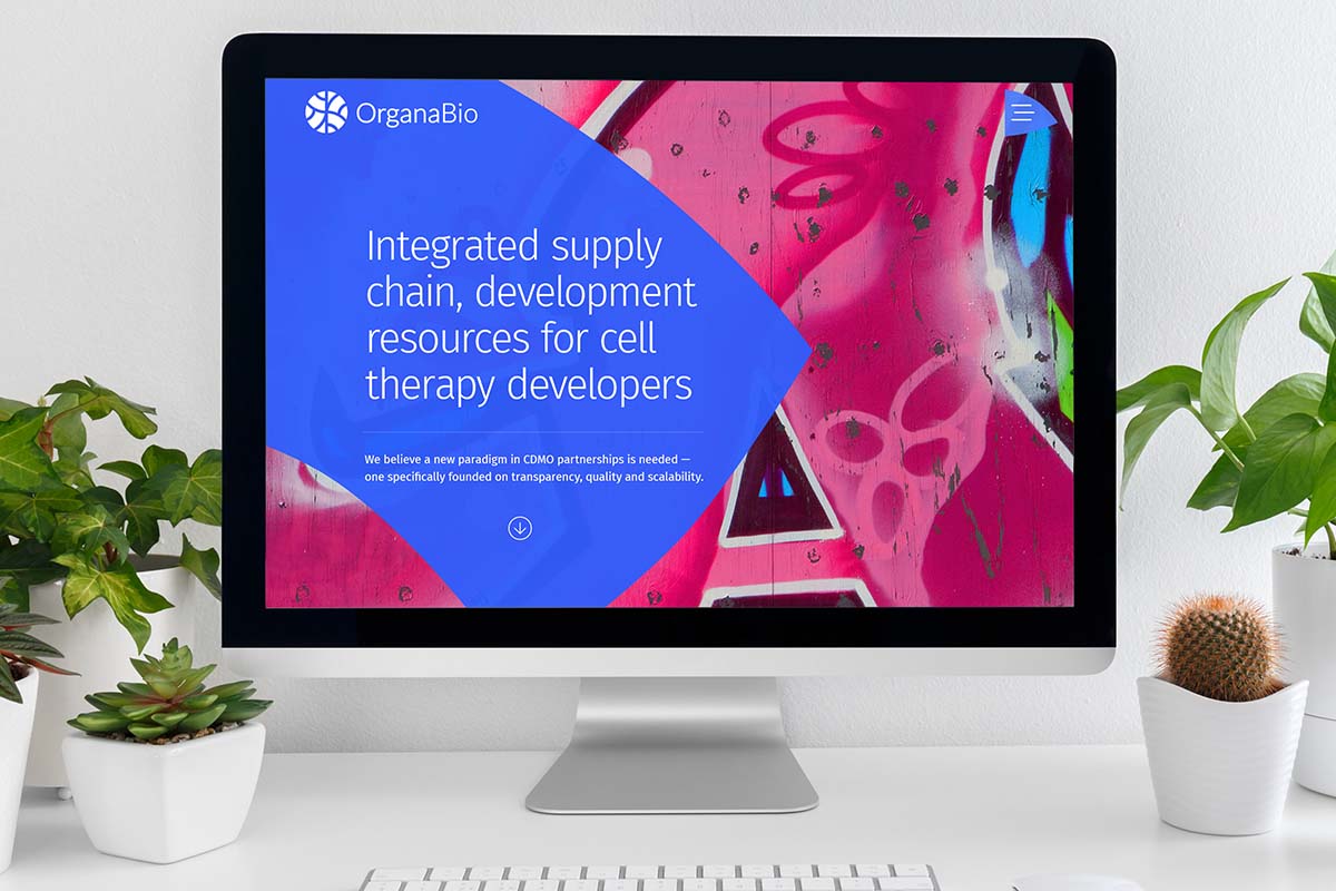
OrganaBio helps startups and big pharmaceuticals smooth out their tissue/cell supply chain bottlenecks. The company is an emergent player in the space and offers a unique partnering model that provides cell therapy developers with highly customizable solutions that meet their programmatic needs.
The Takeaway:
OrganaBio wanted their new website to stand out amongst their competitors while providing the unique Miami grassroots into the design. The website needed to highlight its unique partnering model, providing cell therapy developers with highly customizable solutions. The OrganaBio team was also interested in learning more about search engine optimization (SEO) and HubSpot integration as they began to grow into the CTDMO space across the country, expanding into Southern California.
The Details:
Our team provided an agile process for the CTDMO team to rework the information on their existing site to elevate it. This project was a collaborative process between both teams, using short sprints to work together throughout page building, production, design, development, and polishing of their new website. Our digital agency led them through the content process and writing to give their content a fresh, new outlook to attract the right consumers.
Our biotech website support team continues to support OrganaBio’s growth.
8. Website design for clinical-stage immunotherapy biopharma in Cambridge
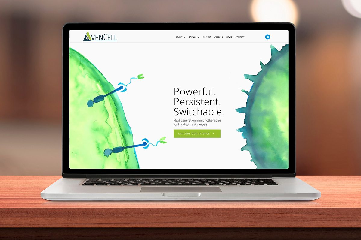
The Biotech Company: AvenCell
AvenCell is a clinical-stage biopharmaceutical company based in Cambridge, Massachusetts. Their scientists and industry leaders are developing next-generation immunotherapies targeting hard-to-treat cancers.
The Takeaway:
AvenCell approached our expert interactive agency to build a website that explained their science and technology clearly and compellingly and could compete in the crowded biopharma space. They wanted a visually striking and unique website that included high-design elements and hard-hitting messaging that communicated the innovation of their immunotherapies quickly and clearly. This project had a timeline set for 12 weeks.
The Details:
Our writers presented several new headlines and concepts that ranged in style and tone, and the AvenCell team ultimately chose the option that articulated the benefits of their science and technology through unique messaging that stood out from the competitors. Our designers worked to incorporate this messaging throughout the website.
Our content team worked closely with the client to understand their company history and the complex science and innovation of their therapies. The clinical-stage biopharma’s website not only highlights their groundbreaking work in creating next-generation immunotherapies for hard-to-treat cancers but also their experienced team of scientists and innovators.
Our Best Biotech Website Designs in 2022
1. Website design for pre-clinical stage biotech company in Houston, TX.
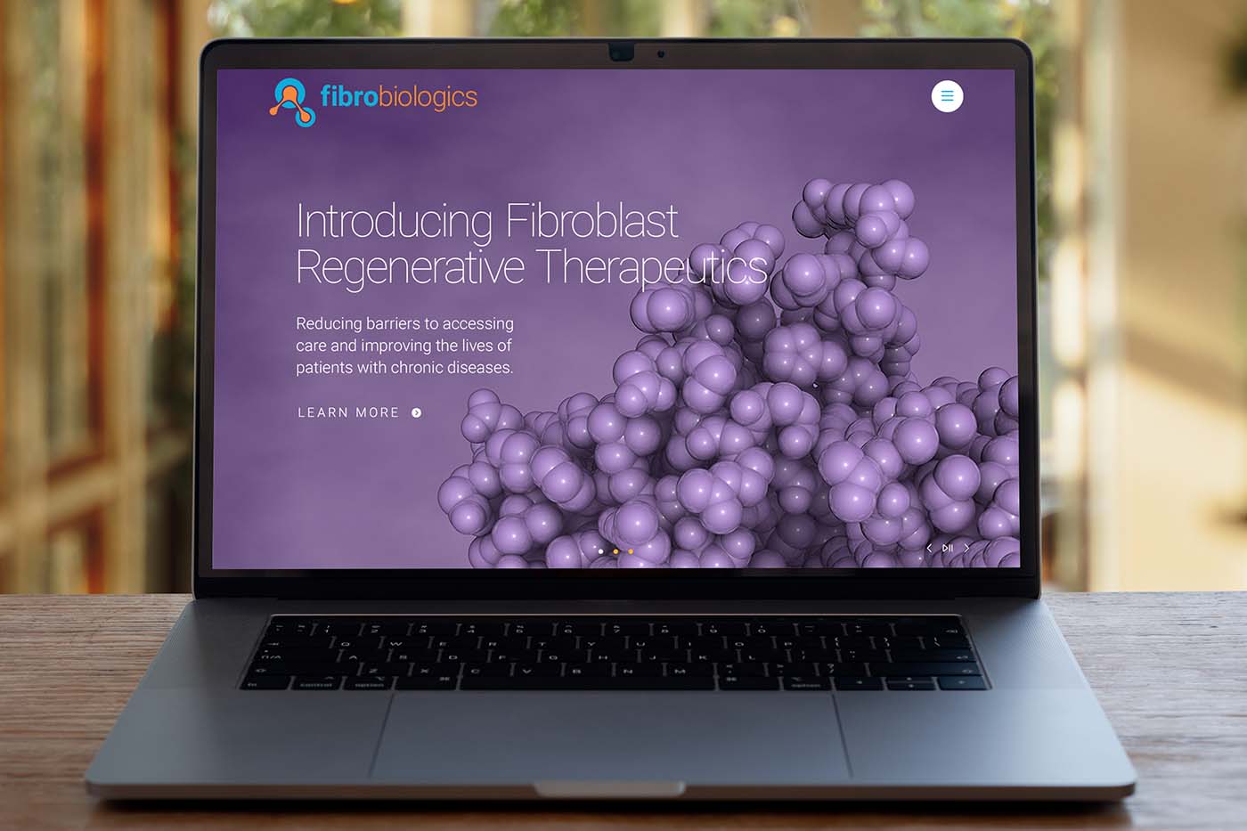
The Biotech Company: FibroBiologics
FibroBiologics is a Houston-based pre-clinical biotech company that develops fibroblast cell-based therapies. Their work has the potential to cure and treat patients suffering from chronic diseases.
The Takeaway:
FibroBiologics had an existing website, but as a company, it had evolved beyond its functionality. Therefore, it approached our digital agency to create a new website that reflected its immense progress in the field of cell-based therapies.
The Details:
FibroBiologics has an extensive patent catalog and impressive technology platform that it needed to highlight with its new website. Our digital agency worked closely with the client to understand its niche in the field and its goals for the new site.
This new website boasts a unique color palate with rich purples and bright orange highlights. The homepage features an image of a human body with interactive roll-over buttons that provide information about fibroblast cell-based therapies to introduce site viewers to their science. The technology page shows a more extensive look into FibroBiologics’ work, both with copy that our digital agency helped produce and with scientific graphics.
After learning about FibroBiologics’ technology, site visitors can learn about the company’s 150+ patents and the latest iteration of their pipeline. Lastly, the client’s publications and latest news are clearly outlined for those who wish to learn more about this pre-clinical biotech company.
2. Website design for a publicly traded biotech company in Houston
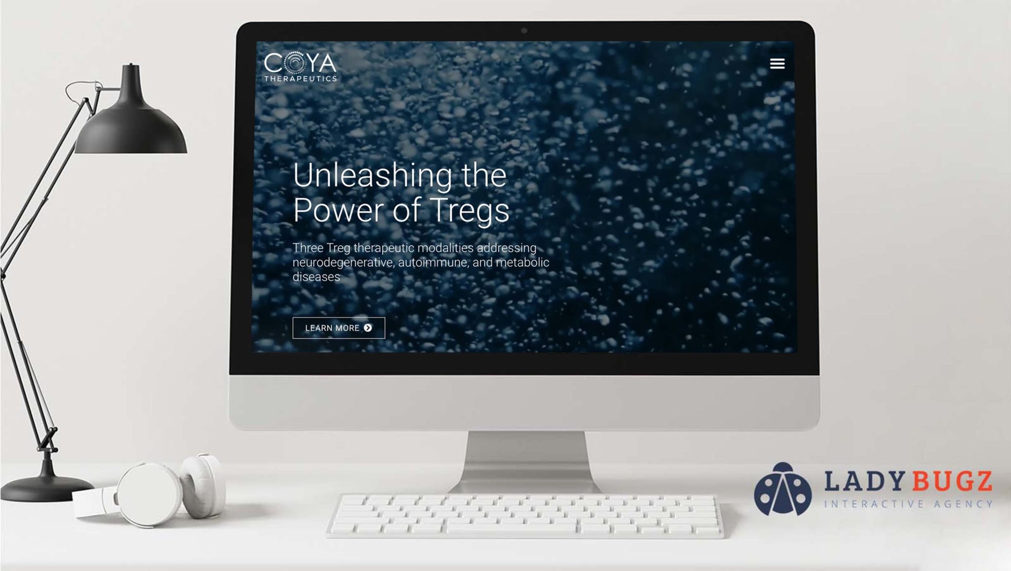
The Biotech Company: Coya Therapeutics
Coya Therapeutics is a publicly traded clinical-stage therapeutics company developing Treg therapies. Their work can potentially improve therapies for neurodegenerative, autoimmune, and metabolic diseases.
The Takeaway:
Coya Therapeutics’ new website is informative for a wide array of audiences. It has everything from a thorough explanation of its technology for industry peers to an investor relations page required of publicly traded companies. This site provides everything this clinical-stage biopharma needs to showcase its Treg therapies.
The Details:
Coya Therapeutics’ board members discovered and leveraged Regulatory T Cells (Tregs) uses. They are spearheading the research and development of new therapies to enhance the function of these cells and approached our digital agency to create a new website to highlight their work in anticipation of their company’s IPO.
A critical aspect of creating this new website was learning about the client’s work in developing therapeutics. The core focus of this website is its science and page, as well as its development pipeline. We worked with the Coya team to understand this technology and studied their existing materials closely. Our team incorporated graphics from Coya Terapeutics’ pitch deck into the site design. We then worked with the client to create messaging for the site and assist with search engine optimization.
Coya Therapeutics wanted to create this new website knowing they were going to go public shortly after its launch and needed to prepare a legally required investor relations page. Using the same design and tone as the core website, Coya’s new website includes a subdomain with a corporate overview and its latest news and events.
Coya Therapeutics’ new website showcases the groundbreaking work that this company and its board members have been doing in Treg therapies since 1995. It is a one-stop shop for industry peers, investors, and even patients to learn about the potential of Coya Therapeutics’ technology.
3. Website design for series A therapeutics biotech in San Francisco
The Biotech Company: SonoThera
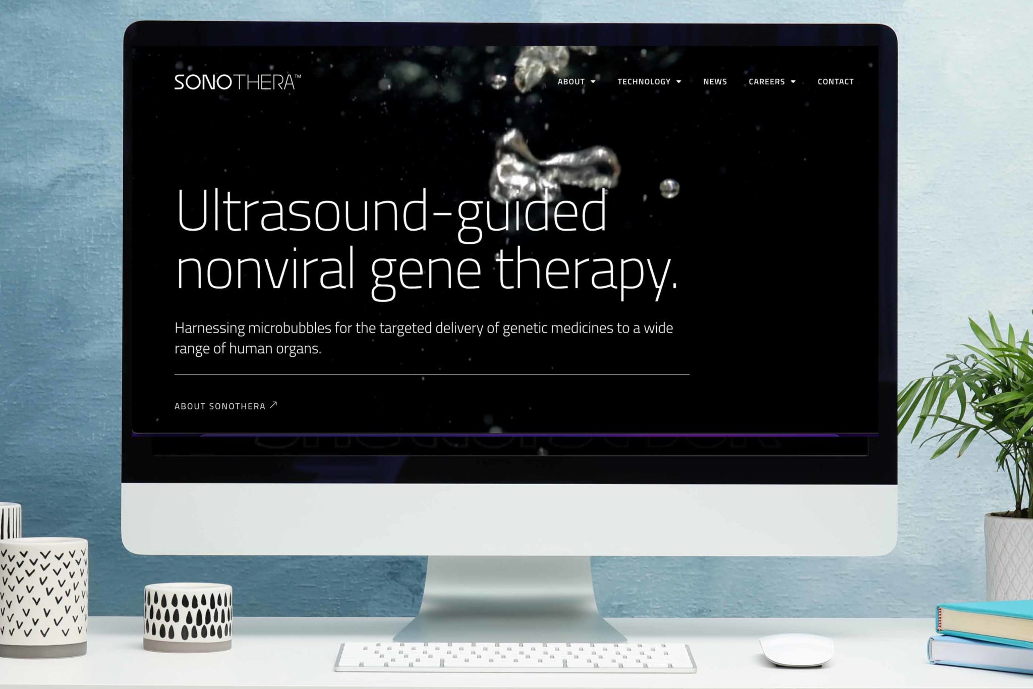
SonoThera, Inc. is a Series A therapeutics company developing novel ultrasound-guided nonviral gene therapy. Their work targets diseases with suboptimal or non-existent treatments, potentially improving the lives and health of millions of people.
The Takeaway:
SonoThera’s new website is aesthetically stunning, with interactive graphics and bold visuals. The site allows SonoThera to commercialize the product they have been developing for decades, and to share the history of their founders’ critical contributions to their field.
The Details:
SonoThera’s founders have been pioneers in the field of ultrasound technology for more than three decades. When they were ready to commercialize their life-saving product, they needed a digital agency to design their new website.
Our designers started by working to understand the client and their technology. We incorporated elements of the clients’ work into the design itself, especially water and bubbles. Our designers worked closely with SonoThera to identify colors that best represent their brand, and wove those colors into elements on every page.
The visual pinnacle of this website is an actual ultrasound video on the designated science page of SonoThera’s new site. This video serves as an introduction to the clients’ technology, which site visitors can read as easily digestible blurbs, or in the catalogue of SonoThera’s published works.
SonoThera’s new website is a testament to the innovative nature of their work, and a nod to their significant historical impact on ultrasound technology. Industry peers, potential investors, and prospective employees alike can learn about SonoThera’s influence on gene therapy and genetic medicines on this visually stunning website.
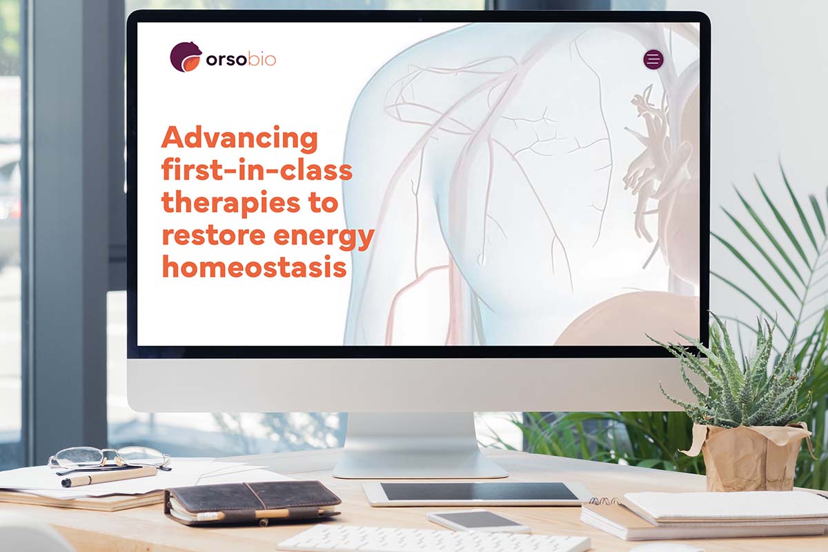
4. Biotech website design for biopharma startup in Palo Alto, CA
The Biotech Company: OrsoBio
OrsoBio is a clinical-stage biopharmaceutical company developing first-in-class therapies to treat patients with severe metabolic diseases. Their work has groundbreaking implications for our understanding of diseases such as diabetes, and even organ failure.
The Takeaway:
OrsoBio’s new website is interactive, informative, and beautifully designed. Industry peers and investors alike can easily navigate the site to learn about OrsoBio’s innovations in pharma. The initial site is a miniature version, created on an expedited timeline to present OrsoBio’s work at an industry conference.
The Details:
OrsoBio needed a new website to highlight its five drug development programs at an industry conference. Their team of medical doctors and PhD scientists had been working on these programs for years but had no branding or website for their company.
Our digital agency began by working with OrsoBio to identify their goals for their logo and branding. We presented several concepts, and the client ultimately chose one that they felt encapsulated their work and their company ethos.
Using that branding as inspiration, our team designed and developed a custom WordPress website for OrsoBio in just a few short weeks. Our content specialists worked hand-in-hand with OrsoBio to do a complete messaging solution, including web copy and search engine optimization.
Their new website highlights the industry expertise of their team of medical doctors and PhD scientists, as well as the incredible work they do. The homepage features an interactive pipeline of OrsoBio’s five development programs, which are featured in more detail on the designated “science” page. Site visitors can learn about OrsoBio’s work through curated content and interactive graphics, as well as a catalogue of their published works.
5. Website design for a public biopharma company in Leuven, Belgium
The Biotech Company: Oxurion Therapeutics
Oxurion is a publicly traded biopharmaceutical company developing groundbreaking therapeutics for retinal disorders. Their work targets the leading causes of vision loss in working-age people worldwide.
The Takeaway:
Oxurion Therapeutics’ website is boldly designed yet intuitive to navigate. Investors, clinicians, and patients alike can easily find the information they need at the click of a button. The site itself is designed to comply with European standards for publicly traded companies.
The Details:
Oxurion needed a new website to highlight its innovations in the field of ophthalmological therapies. Their existing website wasn’t aesthetically pleasing, and was difficult to navigate. As a publicly traded European company, its website also had to meet certain requirements regarding investor relations.
Our team worked closely with the international team from Oxurion to determine potential solutions for their biopharma website. Specifically, we customized every page to communicate to the appropriate audience, while still maintaining a cohesive feel throughout the site.
The homepage and product page both have information about Oxurion’s main product, THR-149, and the diseases it treats written in layman’s terms. This allows potential patients to learn about this therapeutic in an approachable manner.
Additionally, to comply with European regulations for publicly traded companies, our developers created an investor relations subdomain with the help of a third party. This subdomain matches the look and tone of the main site and provides all of the required information for investors.
Lastly, clinicians visiting Oxurion’s site can easily find information about Oxurion and their work through the custom search feature that our developers created. Users can search all of Oxurion’s publications, presentations, and other written materials by file format and publication type.

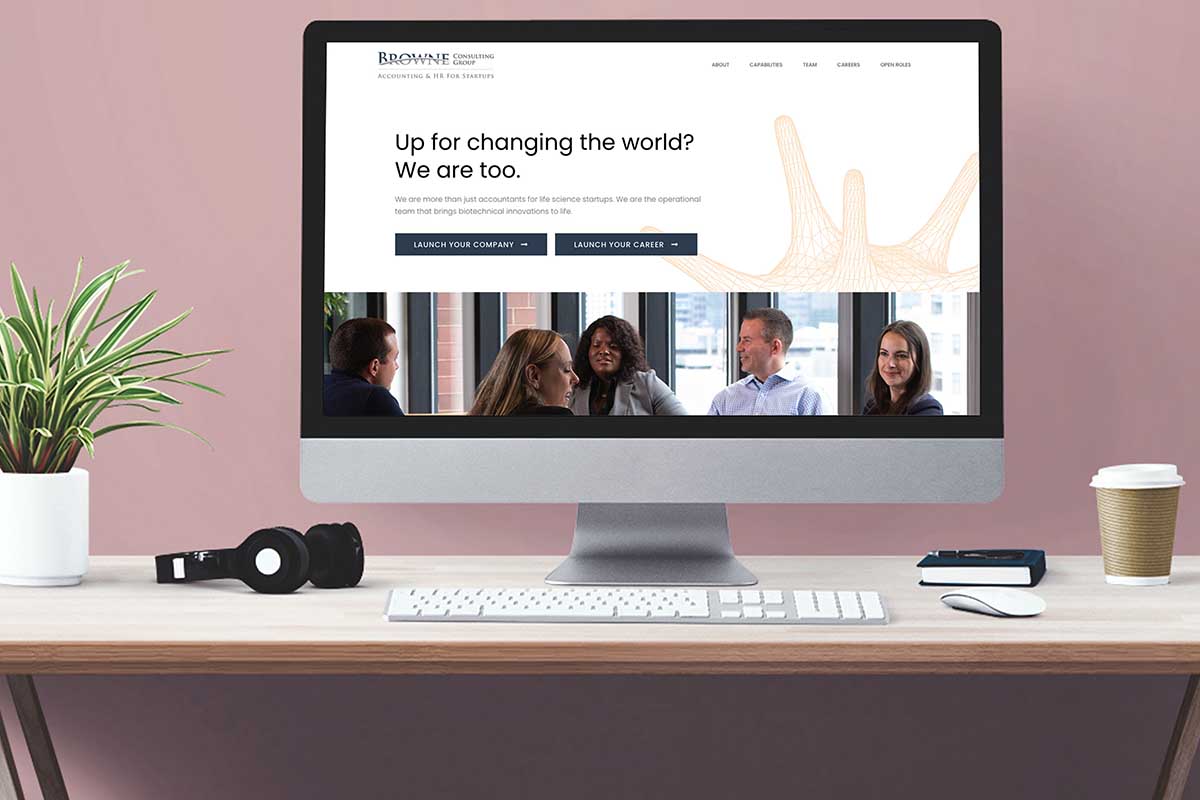
6. Website design for an accounting firm for life science startups
The Biotech Company: Browne Consulting
Browne Consulting Group is a finance and accounting firm that partners collaboratively with biotech companies and their investors. Their team of startup experts has supported 100 venture-backed life science companies from their earliest days to provide customizable, holistic accounting, finance, and HR solutions.
The Takeaway:
Browne Consulting Group’s website is easy to navigate and communicates simultaneously with potential clients, employees, and venture capital companies. They outline available support services for growing life-science companies, highlight the current team and perks of working for Browne Consulting Group, and detail their industry expertise with dynamic statistics and information.
The Details:
Browne Consulting Group grew considerably in a relatively short time span. To keep up with the demand from prospective clients, this Cambridge bioscience accounting firm needed a website that would attract new employees. They offer a stronger sense of work-life balance than other accounting firms, but needed to convey that information in a genuine, humanized way. At the same time, they needed to continue to assure clients that they can support their startup life science companies with their accounting and HR needs.
We worked closely with a team from Browne Consulting Group to identify the core needs of this new website, and to convey all of the necessary information to different audiences simultaneously. We meticulously researched the nuances and trends of both biotech and accounting industry websites, incorporated design elements from both into Browne Consulting Group’s new site.
To demonstrate the benefits of working for this Cambridge accounting firm, our team of copywriters worked with current Browne Consulting Group employees to create case studies about their experience. Through these profiles, employees shared about their increased work-life balance and opportunities for career growth. Throughout the rest of the site, there is information about the tangible benefits of working for Browne Consulting Group, such as shorter work weeks and attractive bonus options.
In order to convey Browne Consulting Group’s expertise and competency to prospective clients and venture capital companies, our design team created a custom, interactive graphic that outlines the accounting firm’s process. This graph shows viewers a dynamic timeline from the seed company through IPO process, and how Browne Consulting Group helps every step of the way.
7. Award-winning website design for CAR-T biotech start-up, in Berkeley
The Biotech Company: Nanotein Technologies
Nanotein created the world’s leading ex vivo CAR-T expansion technology. Their platform uses less time and fewer T cells than competitor reagents to produce clinically potent CAR-T cells. Nanotein’s technology has the potential to greatly improve the speed and efficacy of certain cancer therapies.
The Takeaway:
Nanotein’s website is as stunning as it is practical. Custom animations and informative excerpts highlight Nanotein’s groundbreaking technology. Interested researchers from companies, institutes, and universities can easily request a free test kit from Nanotein with the click of a button.
The Details:
When Nanotein Technologies needed a new custom website to showcase its product, it wanted a web design agency with expertise working with biotech startups. Ladybugz has a reputation for excellence in this field.
Nanotein had a short timeframe for this project, as they wanted their new website ready for launch before attending a biotechnology conference at the end of April. This was not a problem for our digital agency. Working on an accelerated timeline, we worked closely with the team at Nanotein to outline their goals, identify their ideal aesthetic, and understand their voice. Our designer and our copywriter worked closely with the client and with one another to craft every element of this custom website. They spared no detail and ensured that the layout, imagery, and text of each page was suited to the target audience.
Most importantly, Nanotein needed an easily accessible page where interested scientists could request a free sample of their product. The feedback they receive from peers will allow them to improve and expand their technology and is crucial for the future of their work. We were very deliberate about including a call to action in several places throughout the site where potential users could easily request this free test kit.
Nanotein is in the early stages of introducing its technology to the scientific community at large. As their company evolves and their priorities shift, they can easily change their website to reflect that. Nanotein’s technology has serious implications for the future of cancer therapies, specifically tumor reduction. Their new custom website allows them to share their work with scientists across their field and potentially expand this groundbreaking technology.

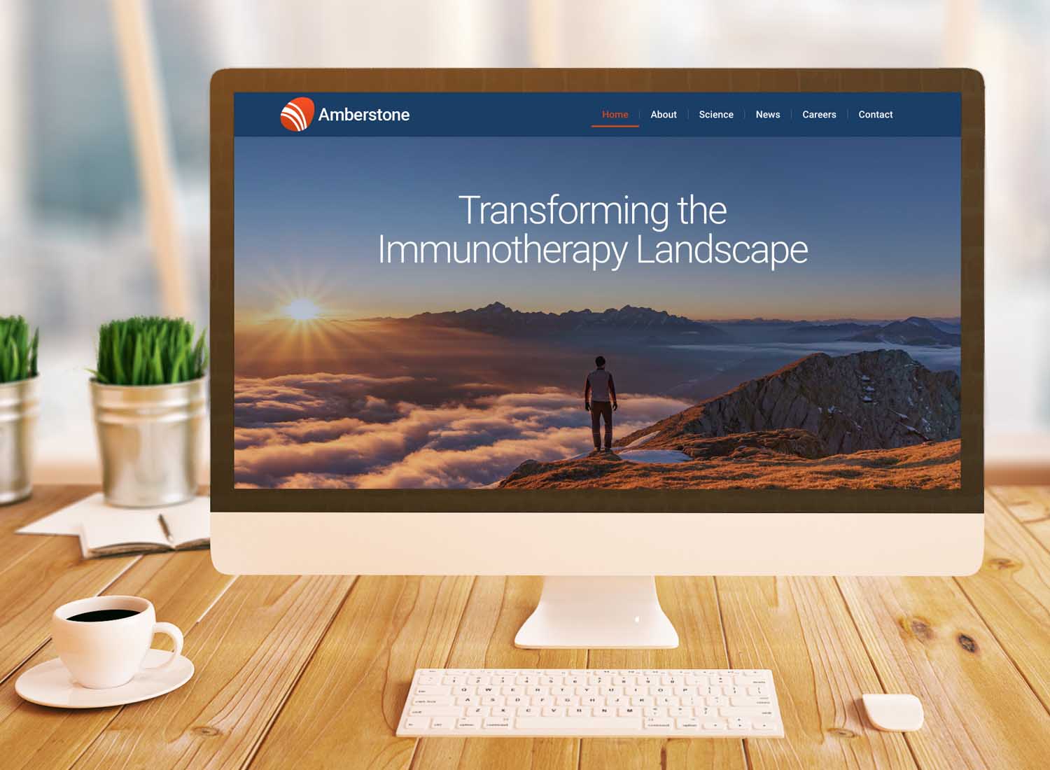
8. Website redesign for a biopharma company in Laguna Hills
The Biotech Company: Amberstone Biosciences
Amberstone Biosciences is a preclinical biopharma company in Laguna Hills, CA. They develop immunotherapeutics with a specific focus on single-cell biology. Their work has the potential to advance treatments for difficult-to-target diseases, benefitting patients with unmet needs.
The Takeaway:
Amberstone’s newly redesigned website highlights their innovation in the field of single-cell technology. Through dramatic imagery and informative yet accessible text, they are able to communicate their message to investors, peers, prospective employees, and patients alike.
The Details:
Our writers and designers worked closely with the team at Amberstone to create a sleek, modern website that caters to their target audiences. Amberstone needed to convey its message to a wide array of readers: potential investors, prospective employees, hopeful patients, and peers in the industry. To achieve this, the language of the website needed to be thorough enough to explain their science, but basic enough to be understandable for readers with no scientific background.
To achieve this, we focused heavily both on imagery and on wording to carefully craft this content with all audiences in mind. Visitors to the site can read about Amberstone’s work in a language that is both informative and accessible, regardless of background. For investors or scientific peers, the “science” page of Amberstone’s website shares more details of their current research. On this page, there is also a call to action button to collaborate with Amberstone.
Lastly, prospective employees can easily learn more about the benefits of working for Amberstone on their “careers” page. Using dynamic graphics, we illustrate the perks and work/life balance at Amberstone before prompting people to apply for a job.
9. Biotech website design for a Genomics startup
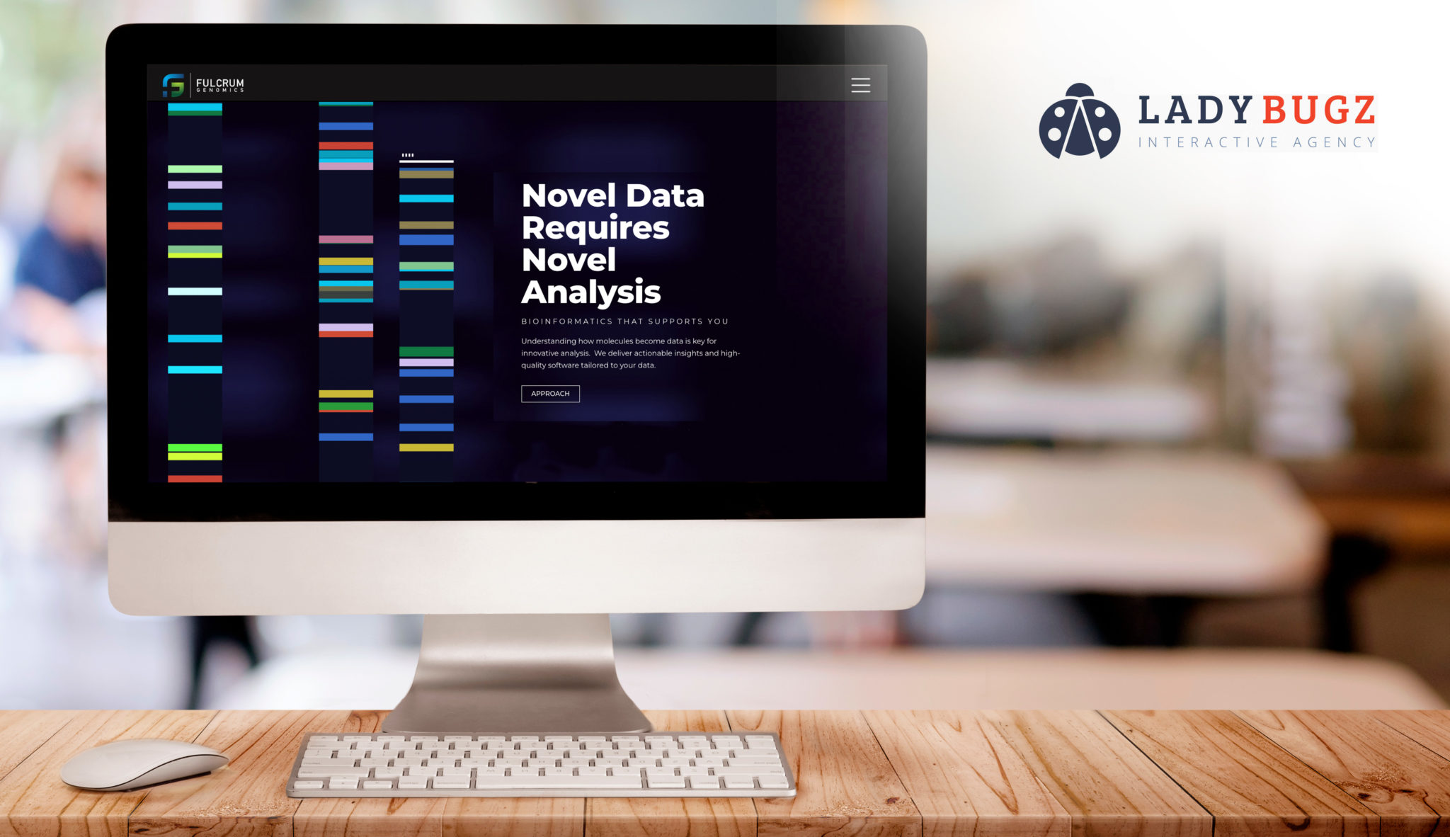
The Biotech Company: Fulcrum Genomics
Fulcrum Genomics is a bioinformatics consulting company based in Phoenix, AZ. They help scientists process, measure, and observe massive amounts of data. Their cutting-edge scientific algorithms deliver value and insights that advance therapeutics and the understanding of human diseases.
The Takeaway:
Fulcrum needed a website refresh with a new, professional aesthetic that would demonstrate its expertise and capabilities. They also wanted to highlight their knowledgeable team, company values, testimonials, and case studies.
The Details:
Our team particularly enjoyed the challenge of creating a moving graphic for the homepage that looks like a bold, bright, sequence of DNA. We used a black background to make the colors pop and captivate site visitors.
One thing that stood out about this project was how closely we were able to work with the client. The point person on the Fulcrum team was familiar with WordPress, and we gave them early access to the backend of the website for increased collaboration.
10. Biotech website design for a drug-discovery company in Boston
The Biotech Company: Cugene, Inc.
Cugene Inc. is a clinical-stage biotech company in the Boston area. The company is spearheading the development of precision immunology and oncology medicines. Their work is addressing the unmet needs of people with certain cancers and autoimmune diseases.
The Takeaway:
In November 2020, Cugene reached out for a complete website refresh. Although they were already five years old, they needed a sleek, modern website that would convey their sophistication as they transitioned from preclinical to clinical. They wanted this site to emphasize their growth potential to attract investors and talent alike.
We led the Cugene team through our agile discovery process to understand the message and tone they wanted for their new site. We were able to design elements of the site that could convey the gist of Cugene’s work without sharing not-yet-public details. The result was a site that provided a “dramatic improvement” to the company image, according to Cugene.

11. Biotech website design for a bioscience platform start-up in Silicon Valley
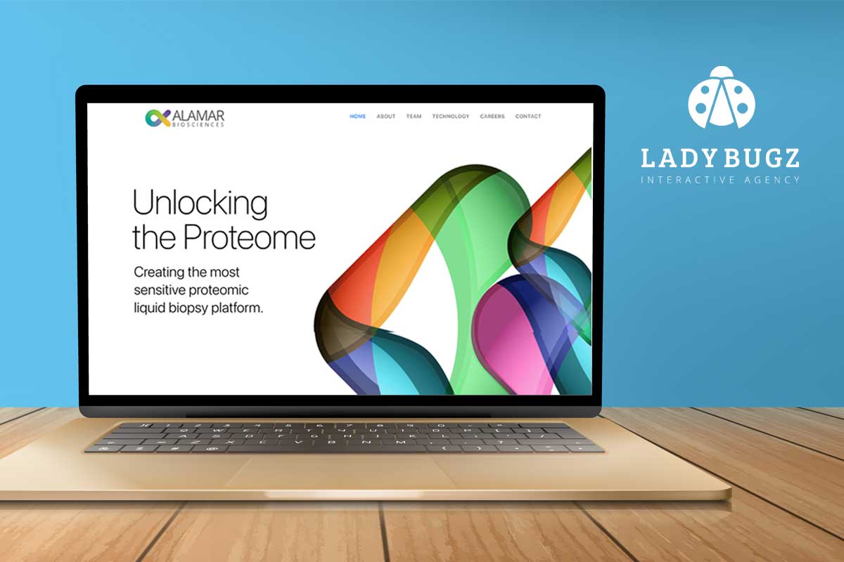
The Biotech Company: Alamar Biosciences
Alamar Biosciences is a leader in the field of proteomics, the study of cell proteins. They have created RNAscope, a technology that is the gold standard in their industry. Their latest work has the potential to significantly improve our ability to detect and prevent common diseases.
The Takeaway:
This homepage is beautiful, sophisticated, and impactful. Don’t take our word for it, though. Its design, functionality, and other outstanding features earned our digital marketing agency a Web Excellence Award for an outstanding website for bioscience.
The Details:
When Alamar needed a custom website to recruit investors and subsequently employees and clients, they reached out to our digital agency. The Biosciences company had a four-week window and a limited budget for this project. Our UX and web designers worked closely with biotech organization to design the look and feel of the website and came up with several options to move forward. The Ladybugz team designed, developed, and launched this custom website within the timeframe. Alamar noticed an uptick in inquiries almost immediately.
Ladybugz created a website that continues to evolve with Alamar Biosciences as their needs shift. After the launch of their website, they acquired $80 million in funding. The technology they have been able to develop could have an enormous impact on healthcare overall. Their website is sophisticated enough to highlight their success in the field of bioscience.
Currently, the Silicon Valley-based biotech is working on an integration with Greenhouse to attract and convert new employees. That feature will be launched in a phase 2 approach in early 2022.
A Website with Focused Design with a Call to Action:
Alamar Biosciences needed a site that would highlight its technology and attract investors and employees. That’s why we created a homepage that guides users to three main pages: Technology, Team, and Careers.
This homepage is elegantly simple. With just two clicks, site visitors can read about Alamar’s impressive technology and learn how to join their growing team.
12. Award-winning Biotech website design for a therapeutics start-up in Boston
The Biotech Company: Pledge Therapeutics
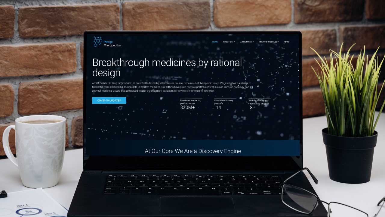
Pledge Therapeutics is transforming and evolving the development of small-molecule drugs. Their work is improving the disease-modifying abilities of the drugs they develop.
The Takeaway:
This biotech’s website is cutting-edge and technologically impressive enough to highlight a company as innovative as Pledge Therapeutics. The clean design clearly highlights their separate biotech brands and technologies.
The Details:
Our digital marketing agency has a reputation for supporting early-growth biotechnology companies. Ladybugz continues to support Pledge Therapeutics as they grow. Because we provided an agile development process, Pledge Therapeutics was able to undergo a phased web build. Pledge Therapeutics’ new, modernized website is built on a scalable WordPress management system that can change as the company grows. The phase 1 version of the company’s website was launched early Spring 2021 but the most recent phase two evolution of the website was launched in early 2022.
Dual-Purpose Biotech Website Design:
The homepage features a stunning design that is simple to navigate. This site needed to distinguish and highlight Pledge Therapeutics’ biotech brands and technologies. We used simple animations to draw attention to the company’s various features without having to leave the homepage.
13. Biotech web design for expanding contract research organization (CRO) in Cambridge
The Biotech Company: Avastus Preclinical Services
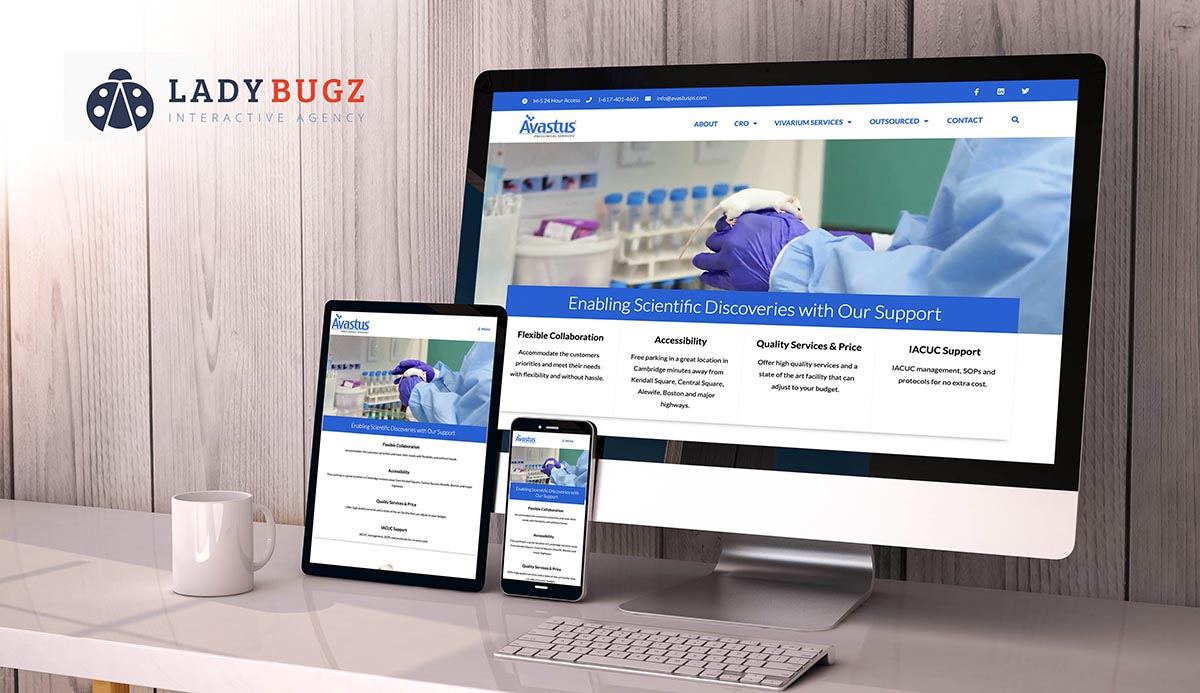
Avastus Preclinical Services provides critical infrastructure to the research industry, from temporary housing for researchers to lab space. Their services facilitate the work of biotechnology startups, R&D groups, multinational firms, and more.
The Takeaway:
The work that Ladybugz did for Avastus increased their web traffic by 200%. Their website highlights their state-of-the-art biotechnology facility with illustrations, photos, and videos.
The Details:
When Avastus expanded to a second location in Cambridge, MA, they wanted to expand digitally as well. They hired Ladybugz for a full-scope branding and web development project. This included photography and videography, SEO and social media consulting, and web support. Avastus appreciated the improvements to their site’s usability and architecture. They were particularly impressed with the way the Ladybugz team worked together and with them to successfully implement these changes.
Captivating Video:
The highlight of this biotech homepage is a video that plays at the top of the page. Viewers are immediately drawn in with a sneak peak of the state-of-the-art labs available at Avastus Preclinical Services. While watching the video, site visitors can read short blurbs that highlight the distinct features available through this biotech company.
14. Web development for a non-profit research organization at the Broad Institute
The Biotech Company: Terra.bio
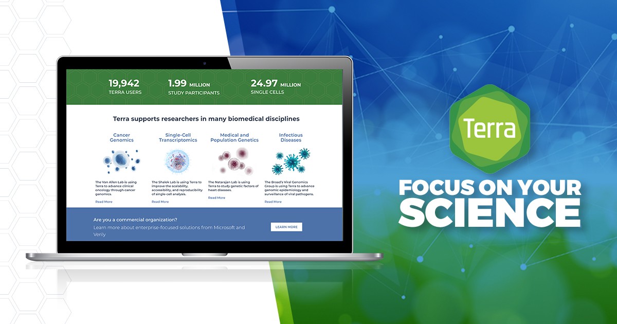
Terra built an open platform to connect scientists to each other. They allow researchers to access shared datasets and tools, creating an accessible and equitable resource for the global research community.
The Takeaway:
We helped Terra.bio team built an elegant website to focus on their mission of advancing scientific discovery worldwide.
The Details:
For Terra’s mission to work, researchers needed to be able to find them online. Terra came to Ladybugz Interactive seeking a marketing website that would highlight their application and provide support for users.
Our web development agency created a website for this biotech non-profit on a scalable content management system. This website includes customer support and forum API seamlessly integrated into the website. We helped Terra build a custom blog and various feed features. Lastly, we empowered Terra to use Google Tag Manager and Google Analytics for advanced data analysis.
Data that Speaks for Itself:
Site visitors are immediately drawn to impressive stats about Terra. The homepage highlights the large, growing amount of Terra users and their millions of study participants. Stunning visuals then prompt people to learn more about the unique features of Terra. Viewers don’t need to scroll to see impressive data or an informative video. As they do navigate deeper into the homepage, however, more details highlight the possibilities offered by this biotech company.
Wrapping up our best biotech website design and development projects.
The website for biotech companies has a big job—and there are many contributing factors. As you develop your biotech website, think of all the factors mentioned here and how your website can reflect the best qualities (and avoid the poor ones).
For the best results, work with a top-notch biotech website design agency that has logo, branding, messaging and website design and growth experience in the biotech industry.
Disclaimer: If you find images of our work on any other agency’s website, note if our stamp is on the footer, Ladybugz Interactive Agency designed and built it and it is being fraudulently displayed on competitor websites and should be reported to Google.
