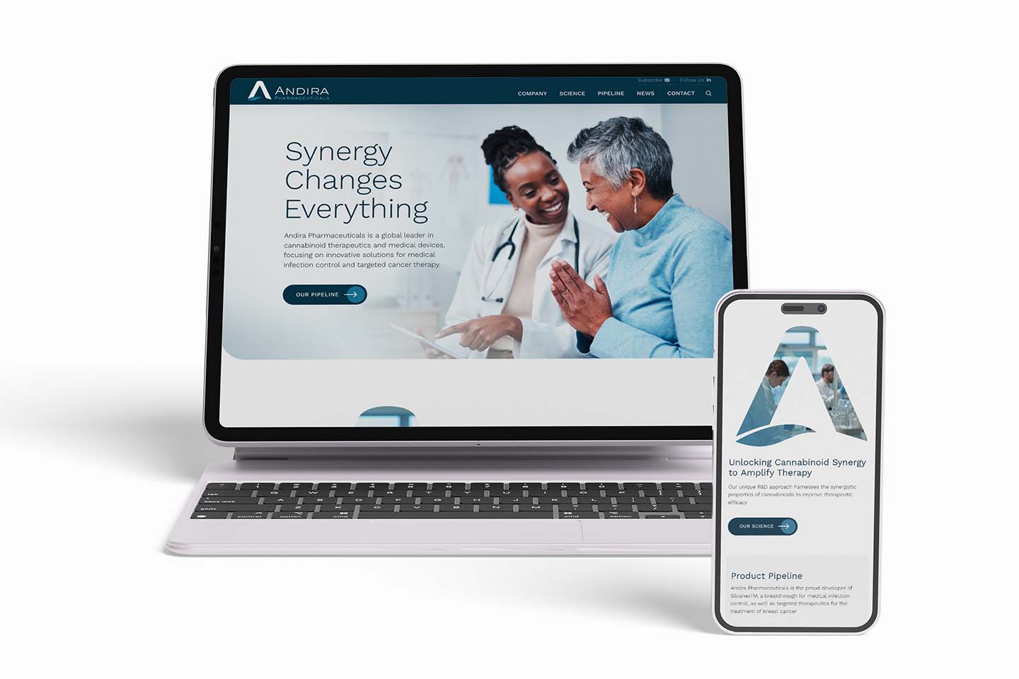
Your biotech website could be the first touchpoint you have with potential new investors. It should have certain components to be able to draw them in and attract them to your company. This is why it needs these critical components to drive success and secure future investments.
A hard-hitting homepage for biotech investors
Your homepage is your first impression. Just as you would wear your best clothes to an important interview, the design and messaging needs to put your best foot forward.
When a potential new investor arrives on your homepage, the first big visual and headline they see is what we like to call the hero space of your biotech website. This section functions as your elevator pitch. It is the 10 seconds or less you get to draw an investor in or lose them, and if this hero space isn’t working hard enough for you… you’ll lose them. But when the hero space does have the right balance of visual intrigue paired with clear, concise, compelling messaging (the 3Cs), you’ll grab their attention and keep it!
Launching a startup biotech website: A complete guide from Seed to Series A
So, now that you have your potential new investor’s attention, you’ll need your homepage to launch them to strategic sections throughout your website. This is achieved by creating punchy, powerful content blocks with one key visual that lead your potential new investors to other parts of your site that further tell the story about your science and technology, why they should care about it, and how they can become a part of it.
Build your case with compelling content
The interior pages of your biotech website should further explain your groundbreaking science and technology. These pages should also continue to build the case for why it is so important through supporting documentation, papers, and research. You will want to build trust with your potential new investors by showcasing your boards, leadership teams, industry experts, and scientists.
Provide relevant financials, such as projections, funds that have already been raised, and plans for future funding and support. This helps establish credibility that your science is supported by a realistic plan or revenue model for how your company is going to make money.
Write human. Break up text.
When it comes to your biotech website content, it’s easy to get bogged down in the nuances and wanting to add the “kitchen sink.” But the truth is, regardless if your visitor is a potential new investor, a doctor, or a patient, we ALL speak human. That’s how your biotech website content should be written.
Keep your messaging clear, concise, and compelling (3Cs).
Also use “scannable” headlines wherever you can for those people (everyone) who scan through content before deciding to double back and actually read it. See how the headlines in this article have visually broken up the text!
You can also break up dense blocks of text with visuals that include diagrams, charts, infographics, and images. These elements often help explain or highlight information better than large blocks of text, and they break up text to make it easier on the eyes. Make sure that your images are clear, high-quality, load quickly, and include alt-tags for search optimization.
Modern website design for your biotech investors
In addition to strong content throughout your biotech website, a modern design that brings your science and technology to life is always the best approach.
Create clean, breathable spaces and a layout that feels open and inviting. A modern design that is never cluttered or overwhelming — will create a truly enjoyable experience. And because the rest of the world is loud, overstimulating, and busy, your biotech website from a design perspective should always aim for less is more.
Imagery and animation that show cells or systems in the body is an excellent way to infuse art and science. This is the trend for biotech website design because it is so unique to each company, their science, and technology. With the color enhancements, textures, and possible movement, your biotech website design will elicit an unmatched “feel good” response. This will put your biotech company in a strong position for future investments.
Create a Top Performing Homepage on your Website: A Mini How To Guide.
Overall, a hard-hitting homepage, compelling content, and a modern design will go a long way for your biotech investors. These important elements will capture potential investors’ attention, build a case for support, and establish credibility. This is what your biotech company needs to secure future investments.
Find a digital agency specializing in biotechnology companies
Biotech companies face a unique set of challenges when it comes to marketing. Your company may require unique marketing strategies, and your biotech website is a lynchpin of your digital marketing efforts. You need a digital agency that has experience working with growing biotech companies. They have the skills to build a website that is right for you.
Here’s a simple checklist to use when looking for an interactive agency to design your website:
- Experience in biotechnology startups
- Pricing that fits your budget
- Availability to meet your timeline
- Collaborative team approach with an agile process
- Technical knowledge
- Familiarity with messaging and content needs for biotech SEOs
- Expertise in SEO (Search Engine Optimization)
- Knowledge marketing strategies for biotech startups
Biotech businesses should consider Ladybugz Interactive, an award-winning, full-service interactive agency that focuses on web design and digital marketing services. Our digital agency works with biotech growth companies to create custom responsive websites and implement integrated digital and SEO marketing strategies that equal success for your business and attract the right biotech investors.

