A Complete Guide to Your Best Biotech Company Homepage Website Design
It’s natural that your biotech startup company is focusing on cutting-edge science, technology, and applications. But are your marketing efforts slipping to the bottom of the pile? It happens all the time, especially with the complex task of putting together a website. We put together a how-to guide on creating the perfect biotech company homepage design.
Your visitor’s journey on your biotech website begins on the homepage.
A basic biotech website usually goes up quickly, but it may be lackluster, fail to meet business objectives and discourage potential customers, partners, and investors from using your website to research your niche and learn more about your company. If your website isn’t retaining and engaging visitors, the biggest culprit might be your homepage.
Most people form an opinion about a website in less than two-tenths of a second. Your homepage—the gateway to your website—plays a pivotal role in forming first impressions about who you are if your site is relevant, and if it offers valuable information. If your homepage doesn’t convey the right messages, visitors will leave after mere seconds.
This article shares the purpose of the homepage, the elements of a successful homepage, and techniques for designing a homepage that benefits you and your visitors.
1. Be Clear: Tell your visitors who you are.
Quickly establish your brand’s relevance and credibility. Clearly (and succinctly) communicate your story—who you are, your mission, a brief overview of the challenges you are addressing, why it’s important, and how your solution addresses the problem.
2. Guide your visitors to information and action.
More than half of visitors spend fewer than 15 seconds on your website, so every second counts. Goal #1 is to engage visitors ASAP by leading them to the information they want. This is not the place to share all the details of your exciting news. Rather, its purpose is to entice them to go deeper into the site and guide them to your key objective—calling you, filling out a form, or buying a product.
3. Create a positive user experience.
Laying the foundations for an effective homepage calls for some basic groundwork. By spending a bit more time upfront, you’ll save time and money. You’ll also decrease frustration with a sometimes complex process. Most important, you’ll maximize results.
This process includes two key information-gathering tasks:
- Website Objectives for a biotech homepage design: Identify the role your website will play in growing your business. A brand-new startup may only need a simple brochure website with a few pages. A young but profitable company may prioritize attracting investors, research partners, or employees. A more mature company may focus more on lead generation and additional financing. Your homepage will reflect these objectives.
- Audience Characteristics: Based on your website’s objectives, you can more clearly identify your most important audiences. The more you know about their interests, concerns, online behaviors, and expectations, the better prepared you will be to meet their needs.
By matching up website objectives with the needs of your audience, you’ll determine what type of website design will provide the greatest value to your company and your website visitors. The design elements of the entire site will all flow from the homepage.
4. Focus on the process of optimizing the user experience.
The homepage sets the stage for creating a positive user experience (UX) that motivates visitors to remain on your site, refer people to it, and return to it later. From the user’s perspective, it should be relevant to their information needs, be intuitive to use, and provide easy access to valuable information.
The basic techniques below hold true for every website, but priorities may differ somewhat based on your niche, company, and website objectives. Your digital design agency can provide advice on how to optimize user experience in the following areas:
Fast loading time
47% of consumers expect a web page to load in 2 seconds or less. 40% of people abandon a website that takes more than 3 seconds to load. Slow loading caused by your hosting service, large files, or unnecessary coding—can tank your entire site.
Navigational consistency:
All inside pages should consistently reflect the navigational style, functionality, and page location that is established on the homepage.
Interactivity:
Clearly differentiate non-interactive text from clickable links. Keep the method of identifying consistent, such as using colors, static icons, and expanding and collapsing icons.
Hierarchical consistency:
Assign each hierarchical text element (such as h1 headings, h2-h6 subheads, captions, and body text) its own distinct style (color, font, size, etc.) and use it consistently through the site.
Flat navigation:
Create a “flat navigation” that enables users to access high-value pages quickly, ideally in one or two clicks. More than that and you risk disorienting and frustrating users. Sub-menus should be long enough to define meaningful subtopics, but short enough to scan.
Simplification:
Even with complex biotech products, the homepage should be easy on the eyes and easy to comprehend. Complicated menus, clutter, more than several CTAs, and dense copy can overwhelm the user.
Website Copy:
Ensure that the copy is high-quality, relevant, accurate, and error-free. Make it scannable with frequent subheads, bulleted and numbered lists, and short paragraphs. Eliminate jargon, avoid hype, and use language that reflects your key audiences.
Mobile-friendly:
Most B2B buyers and investors still use desktops to research solutions and make complex purchases. However, mobile devices are popular in the early research stages. Tips for mobile include using responsive design, increasing the font size, being cautious of certain interactive techniques, and using menus and icons that are large enough to click on using a small device.
How do we get from A to B with a biotech company homepage design?
Keeping all these elements in mind, it’s time to move on to creating a structure for your website, which is established for the user on the homepage and remains consistent throughout the site.
5. Conceptualize your website with wire-framing.
Wireframing visually maps out the entire site and shows how pages interact with each other to create user pathways. The wireframe helps develop logical, intuitive ways to direct users to high-value pages located deeper in the site. Your wireframe will show:
- Primary navigation, which is the main menu that is usually at the top of the page
- Submenus—which work in conjunction with primary menus—break down primary menu tabs into sub-categories that guide users to relevant, high-value pages
- Other types of secondary navigation, including internal links and CTAs such as “Sign Up,” “Learn More,” or “Contact Us.”
Move from wire-frame to layout and design.
During the wire-framing process or soon thereafter, the website designer will create a rough layout, or mockup, usually starting with the homepage. First, a design template is chosen that meets the site’s objectives, design, and functionality needs. Website-wide stylistic options are considered at this point—such as the color palette, fonts, hero image, footer, and other visual elements.
Simultaneously, the backend developer may be working on yet other functional elements, such as additional apps and software, a search bar, a popup chat box, or breadcrumbs that reveal the user’s location on the website.
Stand out from your competitors with the perfect biotech company homepage design.
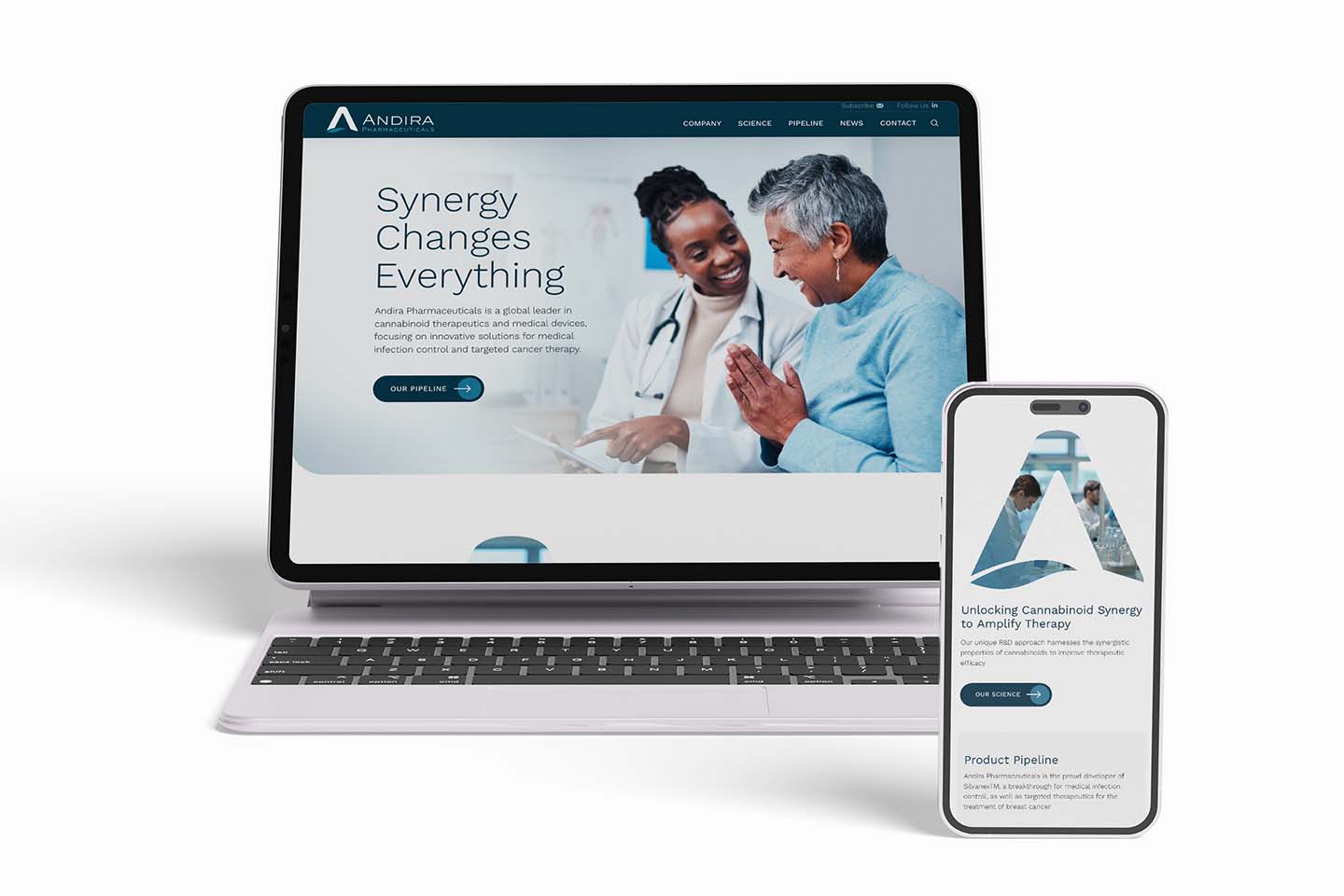
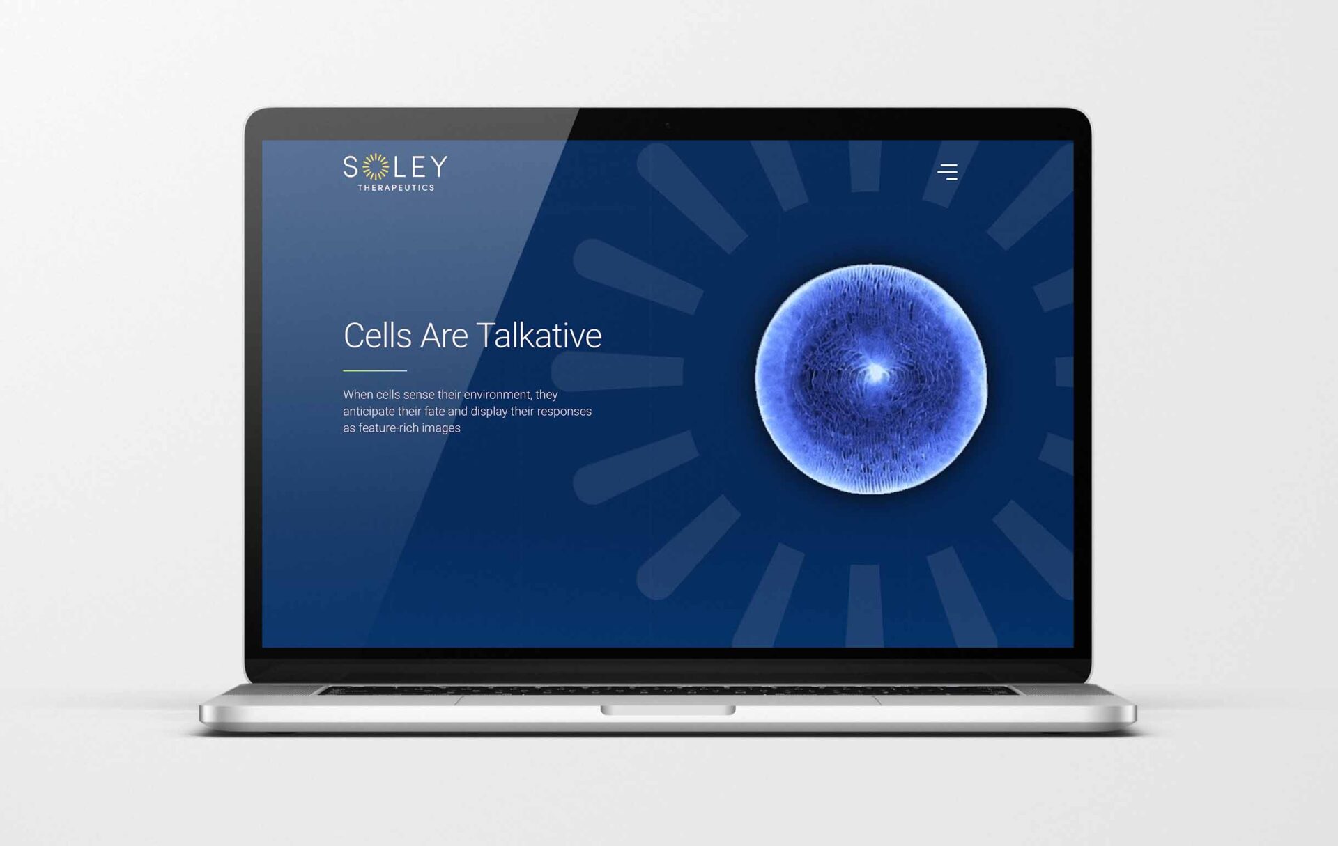
Biotech products are complex, but that doesn’t mean your site has to be boring. While your design should still be credible to your audience, you also want it to reflect your company’s personality. A distinct look can also set you apart and signal that you’re an innovator.
6. Use humanizing language and images on your homepage.
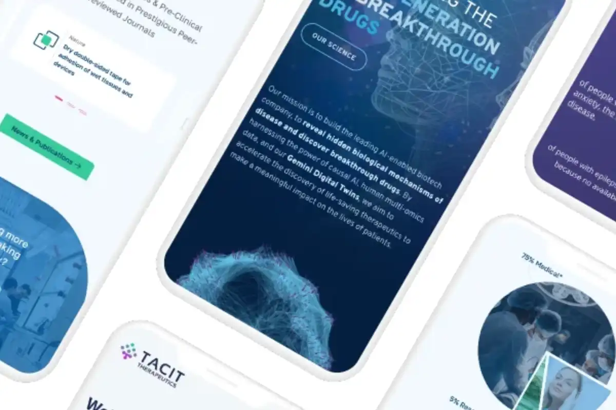
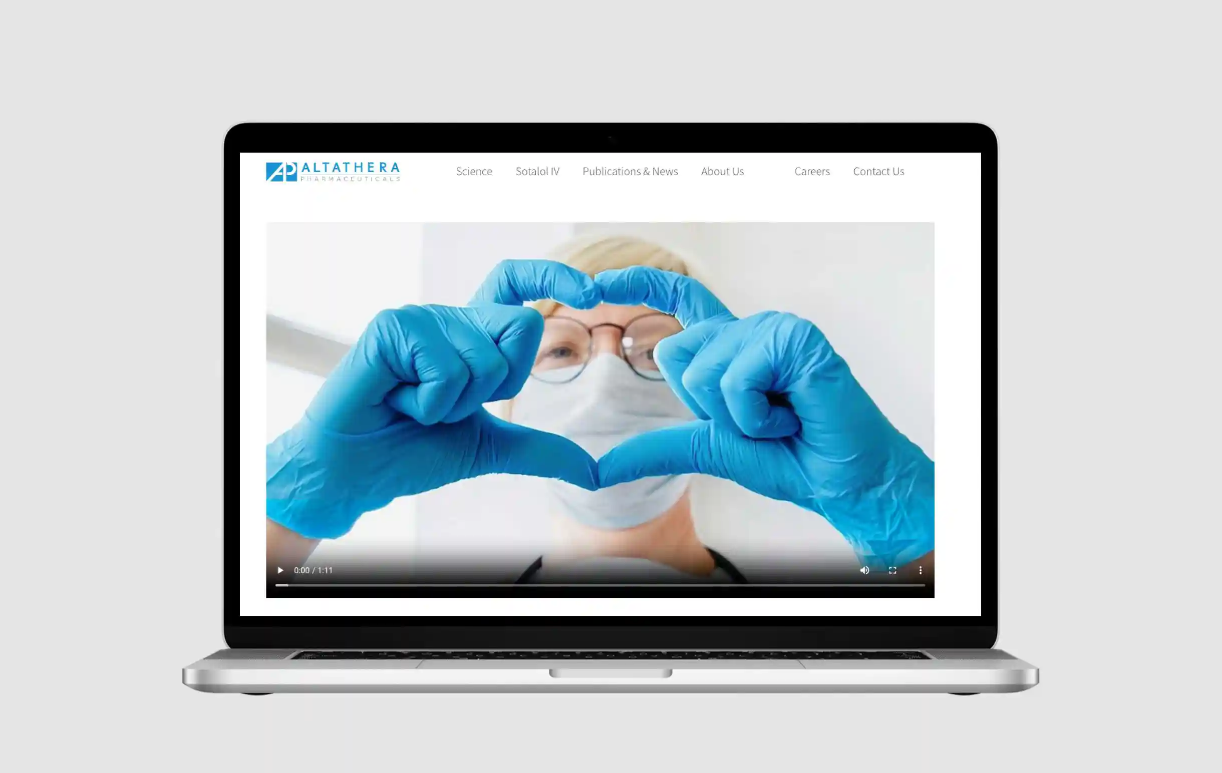
Some biotech homepages make the mistake of using sterile, overly complex terminology, and dense copy—which can turn off even the most hard-core technologist. This is the perfect time to remember that a picture is worth a thousand words. In biotech, the trend is toward “humanizing,” relatable, emotionally evocative images—such as people working in labs medical professionals in clinical settings, or patients who benefit from your technology.
Always use high-quality images that are compressed to optimize load time.
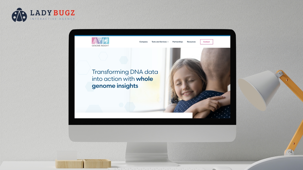
7. Consider a video or a video background for your biotech website—but don’t hold up the project.
The use of homepage videos is rising. However, don’t just cobble sometime together. If it’s not feasible for you to produce a high-quality, branded video right now, set a goal of producing one for “Phase 2” of your site.

8. Provide Visible Contact information on your biotech homepage.
44% of website visitors will leave a website that lacks contact information or a phone number. People will generally look at your footer to find your name, street address, phone number, and email address.
9. Leverage your biotech homepage’s footer.
The footer is valuable but often underutilized real estate. In addition to contact information, the footer is ideal for social media buttons, widgets, a short company description, navigation to key pages, email signups, a login link, a search box, subscription options, copyright, privacy policy, terms of use, sitemap, and branding elements.
10. Don’t neglect social media.
Biotech companies are late-comers to social media. However, avoiding social engagement limits opportunities to build connections, drive website traffic, gain visibility, and stay relevant.
Building a social presence doesn’t happen magically. A coordinated effort takes planning, time, effort, and ongoing management. Plus, neglecting the channels you create can work against you. There’s no need to create a company Twitter account or YouTube channel just because you feel like you “should.” Only do what is realistic for your company to manage. If you do plan to have your own social channels, look at including social integration options, such as widgets and social sharing links, to your homepage.
Plan for the future with your perfect biotech company homepage design.
Once you conduct functionality testing and launch your site, what’s next? As part of your website development process, plan for how you will manage technology updates, add and remove content, gather and analyze metrics, and refine your site over time. You may be able to do some of this yourself, but you may also need to retain the services of a digital marketing agency that can provide maintenance services, expertise, and guidance for ongoing improvement (growth driven design) and optimizations.
Create a biotech company homepage design that sets your website up for success.
Your website allows you to effectively communicate targeted messages to your target audiences, informing them of cutting-edge research, breakthrough technologies, and other important news. Your homepage starts the user’s journey. Make sure you start off right by contacting a digital marketing agency with experience in the biotech industry and creating the best possible biotech homepage design.
Create a Top Performing Homepage on your Website: A Mini How To Guide.
