You know your website needs serious work.
Your website’s branding is inconsistent, it doesn’t generate enough leads, or it isn’t user-friendly. Over time, hobbling together a series of “fixes” can result in causing errors, inefficiency, and other performance issues. Sometimes it’s better to just scrap the old site and do a major overhaul. In the end, most website problems boil down to issues with usability, or user experience (UX). A site that is unattractive, slow, has poor navigation, and is difficult to use can have disastrous results. Specifically, a site with poor UX will have poor organic traffic, increased bounce rates, few page views, and short session duration times.
In building your new website, you want to turn these numbers around. In website redesign, what first comes to mind is how the website needs to change. Your focus may be on branding, functionality, content, or navigation. What is often neglected, however, is what the redesign process will look like.
Create a Top Performing Homepage on your Website: A Mini How To Guide.
Where the website design process gets into trouble
Usually, the website design process is primarily linear: Do your research, create the basic design, develop the site structure, fill in the content, test, and launch. As each step is completed, it becomes more and more difficult to make changes along the way. You are even less likely to optimize usability when:
- Team participation is limited
- Design, content, and development teams are in silos
- Opportunities to evaluate and refine before launch are narrow
When these factors are stirred together in one pot, it tastes rotten! Ingredients include weak collaboration, limited opportunities to explore ideas, and the inability to make modifications along the way. In the end, it’s a constrained process that will have poorer UX than a process that is open to change.
Build change into the website design process.
Website designers and UX professionals recognize that there will be rounds of modifications until the interface has final sign-off.
There’s simply no way to make it perfect during the first pass. What you originally envisioned will morph into something different. There will be push and pull among team members. People will change their minds—often after initial decisions are made. If the team isn’t collaborative and doesn’t accept the concept of change from the outset, things can get ugly. Common risks include:
- Clients will get frustrated when they feel they aren’t heard or feel left out of the loop.
- The project team makes poor decisions if brainstorming and evaluation are cut off too soon.
- Late-surfacing problems will require last-minute changes that are inefficient, slow down the process, and add costs.
- If a pre-determined launch date can’t be extended, users will find an unfriendly interface until the next round of changes can be made.
We know that change is inevitable. We know the risks of a static design process. So why not use an “iterative design process” that embraces the concept of continuous change at every step along the way.
The iterative design process maximizes usability.
What we call website design often refers to the overall look and layout. However, website design elements that promote usability are much more extensive, encompassing many elements.
Think of your favorite websites and what makes them enjoyable. Most likely, you quickly learned how to use the site (and remembered how to use the site at a later date). You like the overall look and the language is clear, and can move seamlessly throughout the site and find what you need. You don’t have to click too many times, scroll endlessly, or face too many other annoyances. Finally, you don’t waste your time by experiencing 404 messages, broken links, or crashes.
These are all user-friendly characteristics that make you stay on the site longer and return more frequently than sites with a poor user interface (UI). That’s the aim of the iterative website design process.
Getting into the nitty-gritty, there are a several UI elements that all contribute to a positive experience. These include:
- Input Controls: interactive elements, such as buttons, checkboxes, radio buttons, dropdown lists, and text fields
- Navigation Elements: Components to access options, such as navbars, menus, pagination, sliders, search field, tags, and icons
- Informational Components: User notifications, such as tooltips, progress bars, notifications, and message boxes
- Design Layout: Page “template” elements applied consistently to website pages, such as grids, layouts, and columns
https://www.ladybugz.com/12-hot-web-design-trends-in-2021-you-need-to-know/
How Does Iterative Design Work?
Does planning for change sound sensible? If so, here are some tips before you start the design process. Define your agency and client teams, their respective responsibilities, and who makes the final decisions. No one should be a passive onlooker; encourage their participation at all stages. Once you have your team in place, you’re ready to roll.
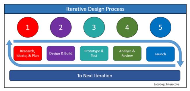
Iterative design can be broken down into six basic steps that form a continuous loop of “iterations”:
1. Research, Ideate, and Plan:
Conduct research that helps you understand the user and anticipate how they will use the site. Explore the problems of your current website and possible resolutions. This step should involve open participation about what the site should include, how to organize it, what should it look like, and other usability elements. Then start project planning—looking at a realistic timeframe, resources needed, responsibilities, and workflow.
2. Design and Build:
Evaluate your ideas from step 1, identify top options for layout, navigation, and functionality. Go through this process until there’s a decision to move forward. Don’t button things up too much—leave room for modification.
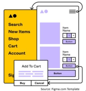
Most teams work on the homepage first because it incorporates so many elements. It will also provide a foundation for inside pages. Before you go too far with layout, content, and development, create a usability wireframe. Think of it as a blueprint that focuses on scope, structure, hierarchy of information, functionality, information priorities, and some visual design elements. The more exact you can get at this stage, the easier the next step (prototyping) will be.
3. Prototype and Testing:
This step takes your wireframe further, going deeper than the basic structure, content, and layout ideas. The goal at this point is to provide a truer representation of what the interface looks like to the user. The graphic designer will create more realistic page mockups that often include nav menus, hero images, footers, and key images. Content is being created and finalized. In the beginning, the prototype may be static. However, at some point developer will start putting content and interactive elements into place. Testing will begin.
Again, try to get the wireframe in good shape before prototyping—at which point it will take more development time to make changes.
4. Analysis and Review:
The navigational and functional elements are ready, graphic design is complete, and content is in place. This is the stage before launch, so it’s time to dig deep. Double-check and test for completeness, functionality, content, and other usability elements. Once the site functions properly, a non-biased focus group can provide feedback before launch. Otherwise, you can get feedback from users and site metrics post-launch.
5. Launch & Next Iteration:
The developer and team will complete any final testing and get ready for launch! Once it’s launched, collect all evaluation and feedback you can to make refinements in the next iteration. Next, the client-agency team returns to steps 1 for a second “iteration”…and so on, in a loop of continuous improvement.
Choosing a New Web Design Agency? Here are the Questions you Need to Ask.
Best Practices for Iterative Design
As with any process, there are best practices that will make things smoother and will deliver better results. Here are key elements to build into the process:
- Focus on the user: Zealously focus on the user’s needs, intent, and anticipated behaviors.
- Communicate and Collaborate: Be transparent and inclusive, with regular team discussions about analysis results, feedback, and recommendations. Also, let developers know about problems that require immediate resolutions as soon as possible.
- Keep the interface simple. Avoid unnecessary elements, keep it uncluttered, and use clear language.
- Be Consistent. For branding, usability, and an efficient design process, be consistent in all interface elements—including items like buttons, colors and fonts, and page structure.
- Use typographic hierarchy. Make it easier for users to read and scan (and help SEO) by being consistent with fonts, h1 and h2 headers, and other hierarchical elements.
- Conduct regular testing: Test functionality and user interface elements regularly to spot any changes that must be made immediately and to note potential modifications for the next iteration.
- Adhere to project scope: With so many ideas from so many people, it’s easy to get “scope creep. In your project estimate, specify time frame, cost, scale, and technology constraints. Let clients know as soon as possible if an enhancement will add to the project’s cost or delay the launch date.
- Conduct ongoing testing Use iterative testing to uncover where usability work, where problems are, resolutions, and other recommendations.
https://www.ladybugz.com/how-much-does-a-website-cost-in-2020-and-how-you-can-get-one-no-matter-your-budget/
Takeaways about Website Iterative Design
“Iterative design” for websites may look somewhat different from one company to any other. The common element is to build change into the process and collaborate at all stages. The result is a happier team, better results, and a more positive user experience.
If you want to design a website that can adapt to change, call on an agency that can lead you in the iterative website design process.
