People are inundated with noise from the moment they wake up in the morning until the moment they go to sleep at night. It’s a part of our overstimulated, information-overloaded culture. It makes it difficult to get your message out to the world as an emerging biotech company and why it’s critical to incorporate these proven biotech messaging strategies into your website.
While there are many messaging strategies that can work, these strategies are among the top that will ensure your new biotech website design is paired with content that captures attention, drives action, and introduces your science and technology successfully.
Here are our top 6 biotech messaging strategies for your new website in 2023:
1. Grab attention with hard-hitting headlines.
To stand out in a crowded marketplace, your messaging needs to be hard-hitting. The average attention span is shorter than ever before so headlines that use targeted precision words …
Stacked.
Like.
This.
… are quite effective!
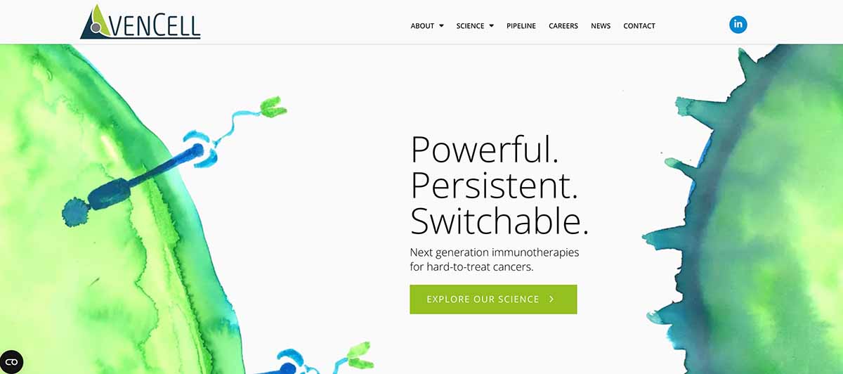
AvenCell approached our expert, creative team with a website that already had a lot of great information, but wasn’t grabbing attention. They wanted their homepage hero space to stop people in their tracks while also very quickly explaining their complex next-generation immunotherapy. The word stacking technique mentioned above struck just the right balance and incorporated a creative concept that our agency’s writers uncovered early in the creative process of their redesign.
The concept of persistence hunting emerged that was based on the way their immunotherapy targets and hunts cancer cells. The AvenCell team quickly loved this biotech messaging concept and landed on using the word persistent in headlines and content throughout their new website.
It became a key and defining descriptor of their immunotherapy. Paired with an original watercolor that one of AvenCell’s employees hand-painted to illustrate their immunotherapy and cells in action, the homepage became a true work of art.
2. Create meaningful conversations with questions.
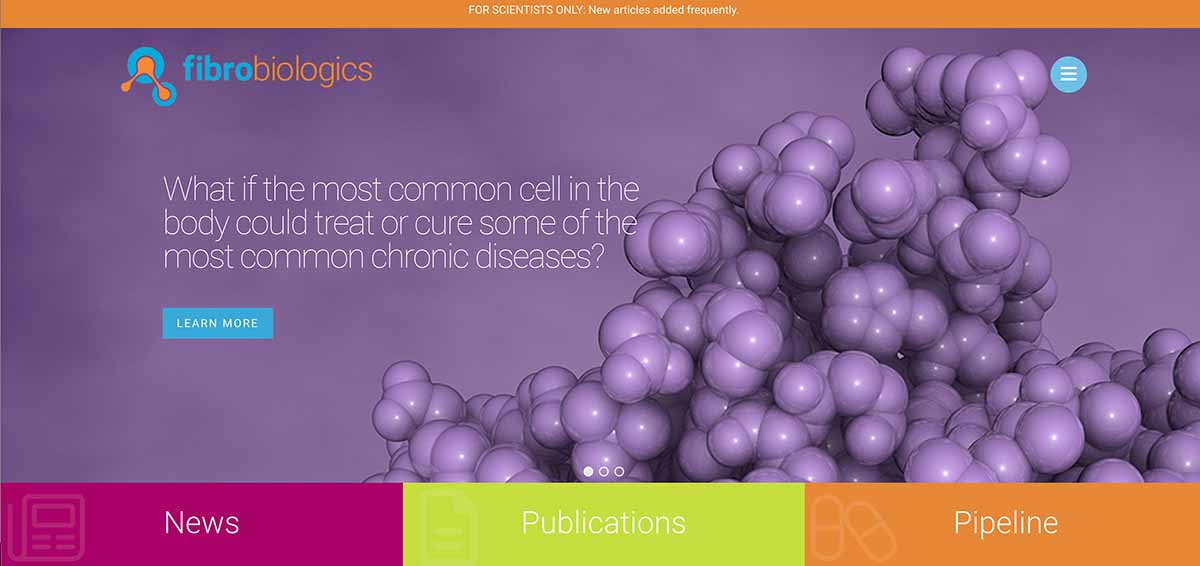
Fibrobiologics needed a new website that could house very technical, scientific content and build the case for why new partners and investors should come on board. A question-and-answer approach to messaging developed as a means to try and mimic some of the many conversations they were having with industry peers, doctors, and investors at conferences and meetings.
To further explain their innovative fibroblast cell-based therapies and answer pressing industry questions, this format worked well for Fibrobiologics. Our agency’s writing team felt that a series of provocative questions throughout the site could create the kind of 1:1 conversation the Fibrobiologics team desired.

Their homepage hero space centered on one very provocative and intriguing question that would hook visitors further to their website. On interior pages, subheadlines also followed that same question-and-answer approach. Overall, this messaging strategy created a natural “conversation” that offered scientific answers about their new cell therapy.
3. Be clear and concise with your biotech messaging
Sometimes the best way to say something is to just say it. For the early-growth biotech startup, SanaHeal, its product was so new and unique in the market that their priority was to explain their science and inspiration quickly and clearly. The inspiration behind SanaHeal’s bioadhesive technology that stops bleeding mimicked nature’s ability to adhere to wet and challenging surfaces just like barnacles and spider webs do.
Communicating this interesting aspect of their technology was an important focus area.

The biotech messaging and design team treated the homepage as if it were a billboard. We wanted every visitor who saw their sign to very quickly understand their science and technology. With clarity being at the heart of their website, the rest of their new biotech website content flowed easily. It also supports and shares the story and inspiration behind the innovation that could transform an industry that had never seen products like it.
4. Use consistent, actionable copy.
Every successful website needs strong, consistent calls to action (CTA) to drive visitors to take that extra step. A website without a primary action step is just a pretty set of pages and images about your company. CTAs bring new investors and partners on board and increase your bottom line, which is why they should always play a part of your biotech messaging and be integrated into your website.
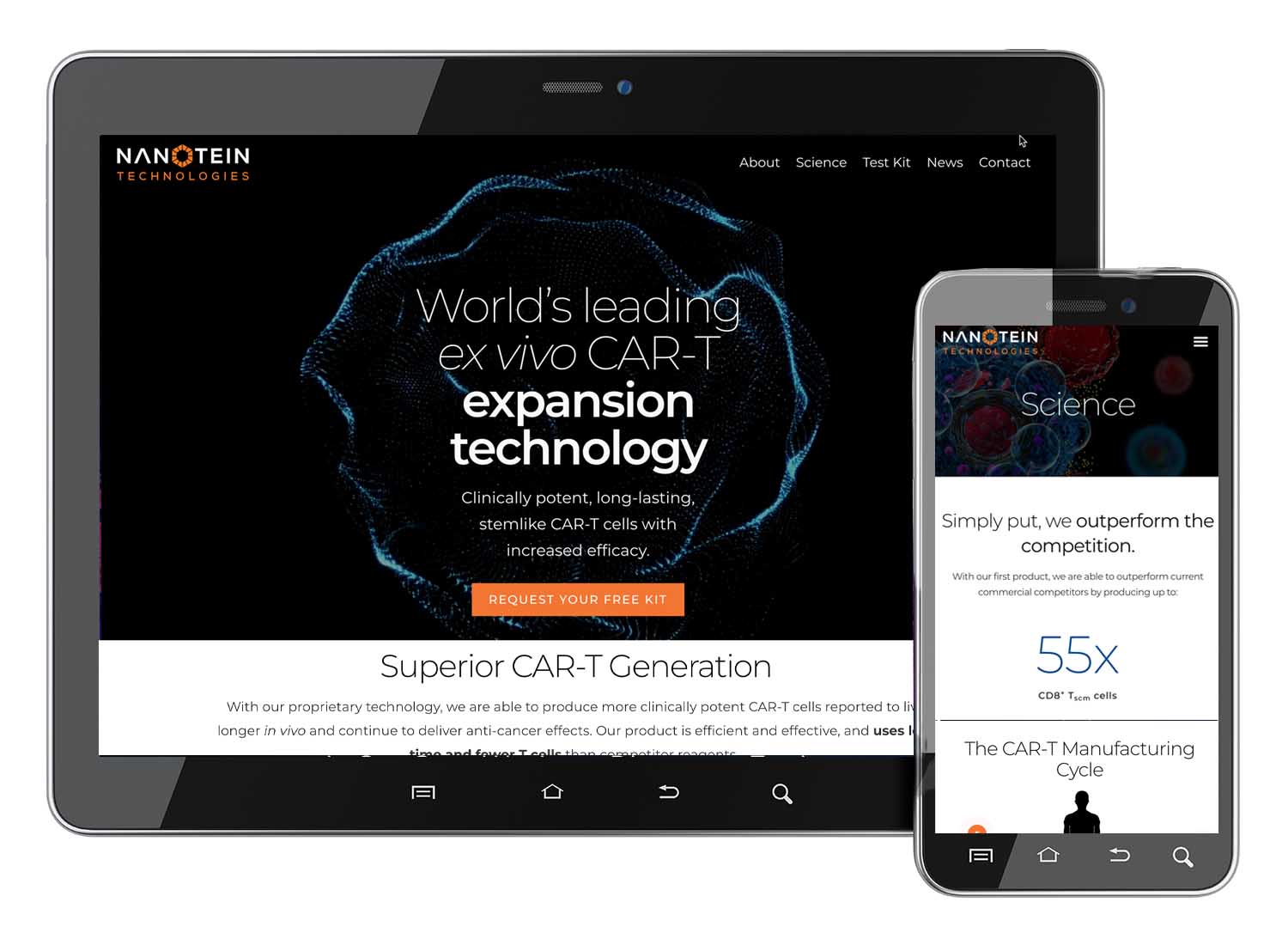
Berkeley Labs biotech startup, Nanotein needed a beautiful new website design that would introduce their proprietary CAR-T technology to the world. But more importantly, encourage people to purchase their test kits. This was achieved by including a very clear and consistent call to action at the bottom of each web page.
Using CTAs throughout their new biotech website, with their primary action being to purchase a test kit, Nanotein turned their beautiful new website design into an actionable tool that could measure their future success.
5. Build trust and credibility through storytelling.
Building trust and credibility for a young and emerging biotech company is critical, and storytelling is a powerful way to do it. Drawing visitors in close to tell them your story, as you might do around a campfire, is a tried-and-true practice for building intimate connections that translate into trust.
OrsoBio wanted to highlight their expertise in the field and many years of experience while also sharing the inspiration behind their name Orso, which means Bear in Italian.
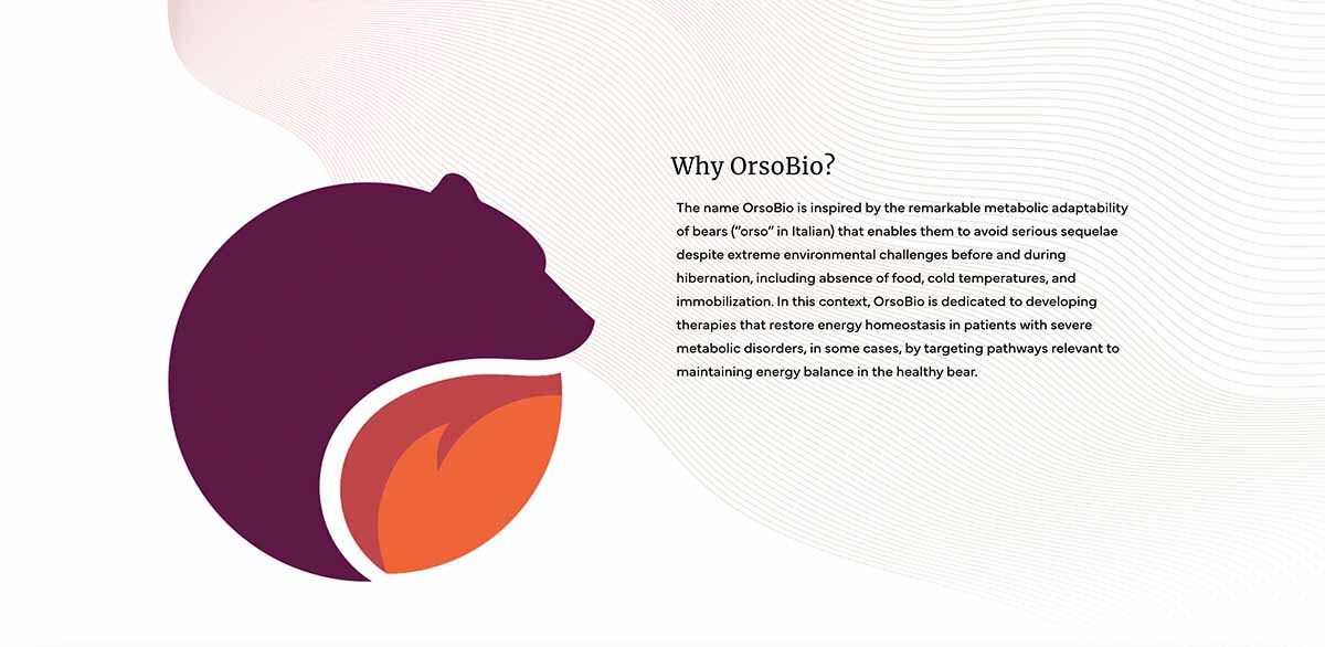
By taking a narrative approach to their new biotech website, they were able to tell their full story and showcase their science and technology. It also highlighted the expert team working on the frontlines of innovation, and the future with their technology in it.

6. Segment content for a customized experience.
Custom is king and segmentation offers a customized biotech messaging approach that works. Just as you would never speak to a child the same way you would to an elder, providing segmentation is an opportunity to speak to different audiences in more meaningful ways.
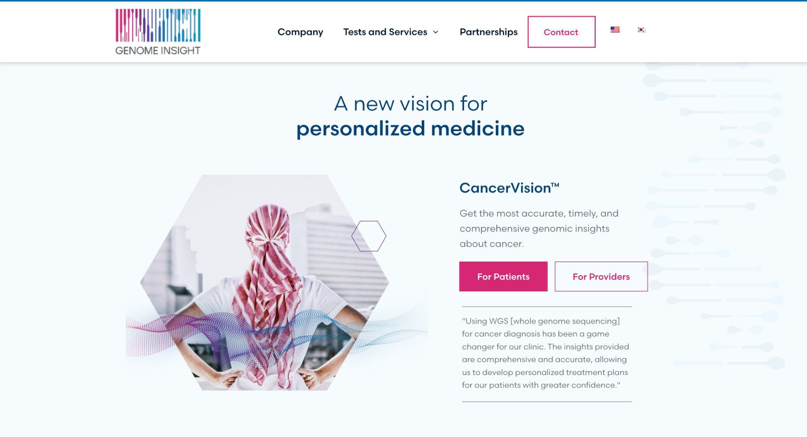
Genome Insights had three main audiences they wanted to address in very different ways. They decided to segment their website for patients, providers, and partnerships. This strategy created more direct, impactful, and meaningful messaging opportunities. This messaging utilized a nuanced voice and tone to deliver the most important content to a patient, provider, or partner.
If your biotech company targets more than two very different audiences, segmentation would be a strategy worth exploring. The benefits it provides will yield better website outcomes.
Be Heard in A Crowded Market With Strategic Biotech Messaging For Your New Website
The biotech space is crowded and noisy. Don’t add to that noise. Be heard and get your biotech messaging across with custom content creation during your biotech website redesign or creation process. You’ll work with an expert writer to help write those big headlines that will get you noticed. We will also edit your scientific information into copy that is easy to consume, compelling, and concise.
To discuss how our web design agency’s writers can help you write a competitive biotech website, contact our experts today.
