Top biotech website design trends to launch your startup’s science into the digital world.
When building or redesigning your website, it pays to understand biotech website design trends that support current design and user experience. It’s not easy to stay ahead of the curve in biosciences’ fast-moving, competitive world. With life science taking front and center stage, marketing often takes a back seat. However, reaching that next step relies on leveraging your website to expand your reach, build excitement, and demonstrate credibility to investors, scientific partners, and customers.
According to a Stanford study, 75 percent of individuals rate an organization based on their website design. An up-to-date site that calls on the most current techniques is your best opportunity to capture the attention of those you rely on to take your business to the next level.
As a creative and web design agency specializing in launching biotech brands and websites, our experiences have helped us craft websites for our clients that help them raise investment to further the companies’ growth.
Here are the biotech web design must-haves trending in 2025.
1. Dark-mode web design makes a comeback
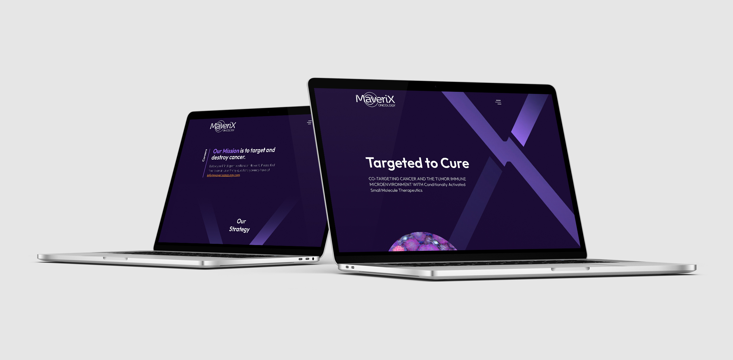
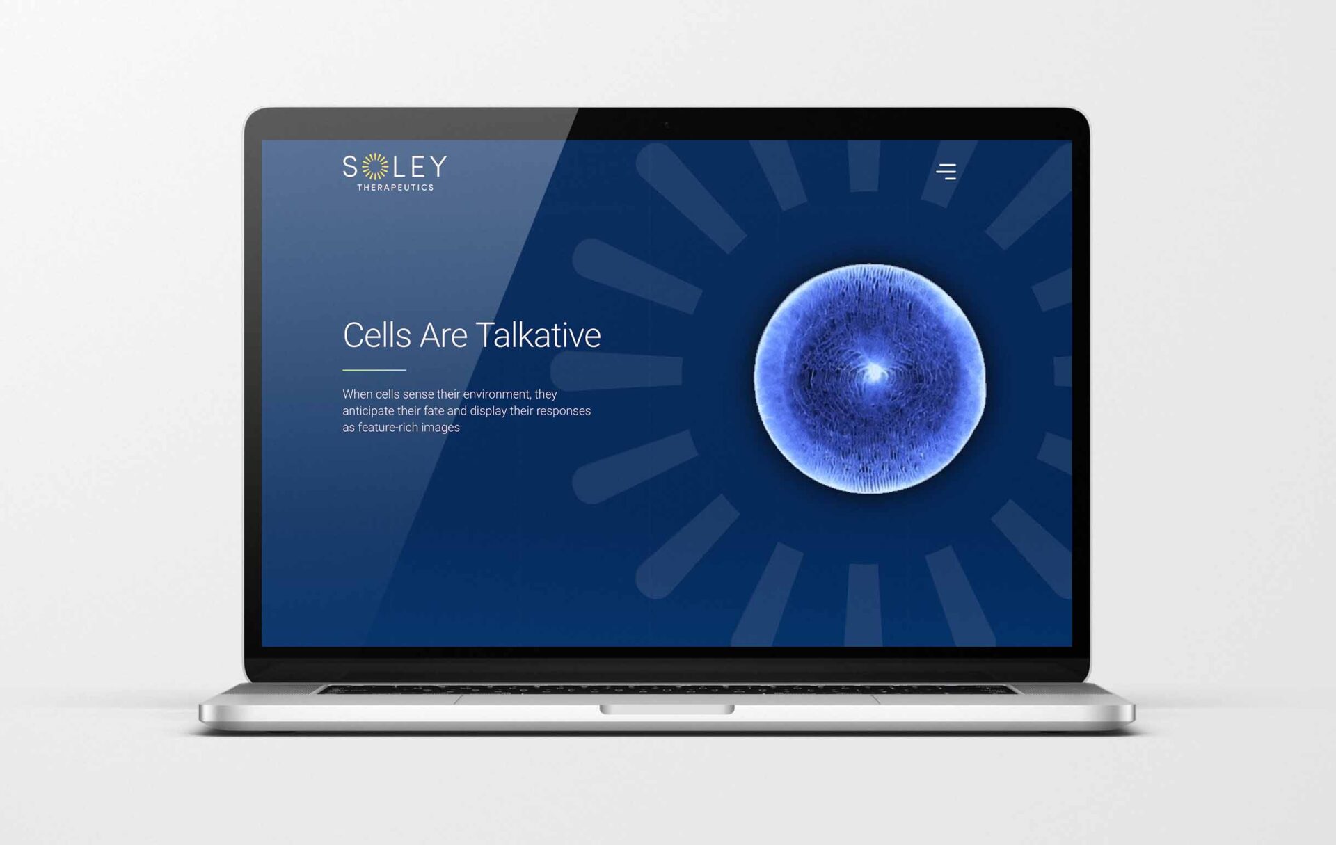
A newfound demand for dark-mode websites for biotech startups
In the early 2020s, in our experience, many biotech startups wanted heavy text, diagrams, animation, and illustrations on their websites. Many times, we were able to guide companies through this process for more simplified, modernized, and impactful designs and messaging. Over the past couple of years, the trend of a higher level of design and messaging has become more popular as more companies work with our agency to launch their companies with this concept, starting the gate.
Seven dark mode website design examples that stand out in 2024
MaveriX Oncology worked for a year to design a site that was not its vision. After an unsuccessful attempt to launch the site, they contacted our digital agency to help them tell their story through content and design. MaveriX opted for a big vision and a bold, dark website that focused on brand colors the team had not yet attempted to use as a main color palette. MaveriX had a bold, dark website with a big statement in just eight weeks. Since then, the company has attracted attention and returned to our agency to help with a new website version for its next growth phase.
2. Disruptive design
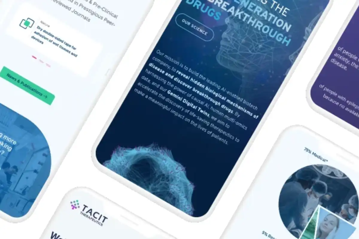
Many launching biotech startups want to disrupt the market with a splash. That was the case with TacitTX, who wanted to make a statement with their disruptive biotech science.
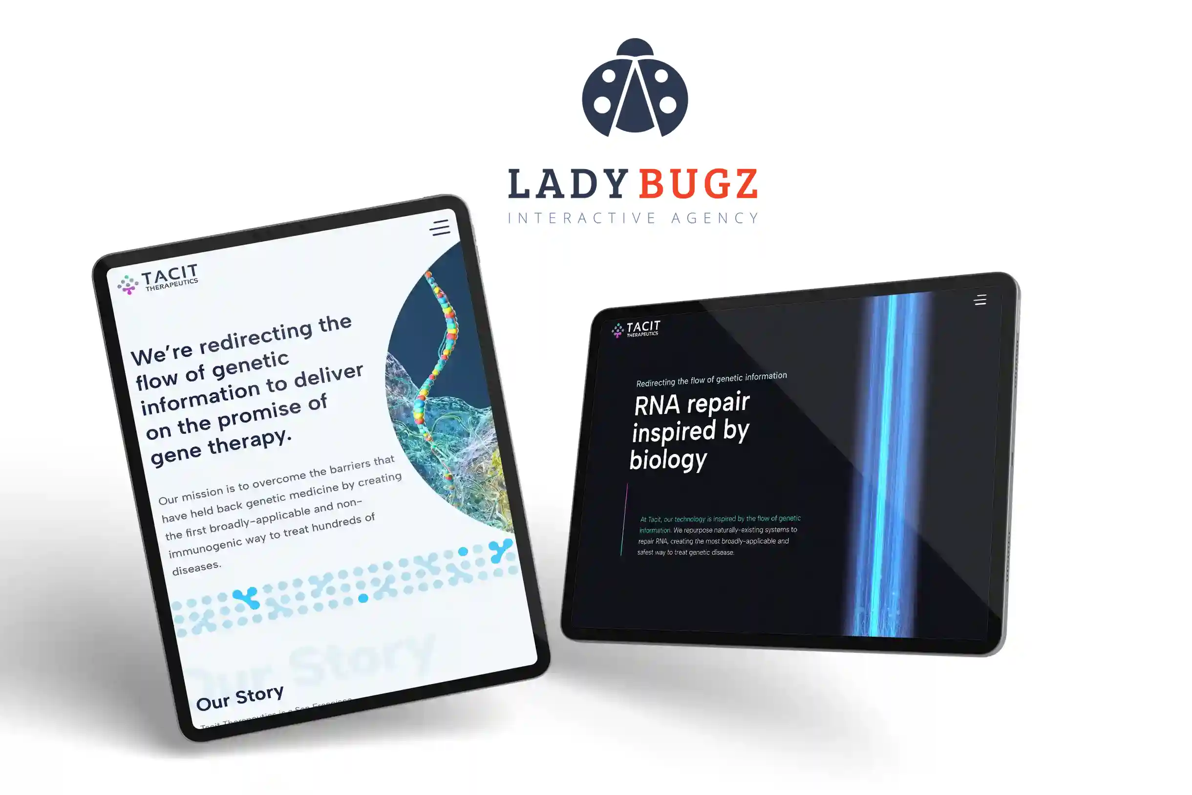
Tacit Therapeutics wanted to introduce new therapies by making a splash. How better to do that than with a disruptive website design? A disruptive website design challenges traditional design with a mix of dark mode sections and bold bright colors and patters.
3. Humanize your biotechnology website message through text
Speaking to your audience is at the top of the list regarding biotech website design trends, and with good reason: read on.
Who are you? How do you work with partners, investors, and customers? How does your company help people improve their lives? While hard science is at the root of your business, your target audiences also want to understand what makes you tick and what it will be like to interact with you.
Biotech companies are moving toward giving their websites a more human-centric approach in their website—and the words they use. We used this strategy in the Fulcrum Genomics website, which packs a lot of personality into the homepage copy:
Approachability
You can’t get any more approachable than starting off your homepage with “Nice to Meet You.” Connection is reinforced by simulating conversation (using “we” and “you”) and avoiding lack of jargon and hype.
Partnership and Teamwork
This bioinformatics firm wants to be a long-term partner who cares about your success, as seen in this sentence on the Approach page: “We’ll work with you and your team to solve your problem and build a lasting relationship for years to come.” And on the Projects page: “We’re Here to Help.”
Relatability
The company relates to the user through shared traits. The About page says: “You’re an innovator. So are we. See, we already have something in common,” adding that they are “bioinformaticians that understand you.”

4. Minimalism: Little is more.
One of the simple biotech website design trends that can say a lot
We live in an age where minimalism has gained steam in popular culture and lifestyle. No surprise, then, that website design now focuses on simplicity and clarity, with 85 percent of website designers saying that crowded web design was the most common mistake by small businesses.
Orsobio, a therapeutics company, effectively uses a simple approach throughout its website:
Website Navigation:
There are only three main menu options for fast and easy navigation.
Website Graphics:
The theme colors are harmonious, clean graphics support the copy, and plenty of white space makes for easier reading. Points of interest include a subtle swirl design that adds texture and an eye-catching burst of color at the top of all internal pages.
Website Copy:
The homepage copy is brief, in small blocks. The copy communicates complex information but doesn’t go into the weeds. Instead, “Read More” options provide the option to dig deeper.


5. Site Speed is one of the most important biotech website design trends:
Users demand speed—and smarts, integral parts of design.
Website performance is critical for boosting user experience, with research showing that 47 percent of people don’t wait for more than two seconds for a webpage to load. Website speed is also one of Google’s page ranking factors.
Biotech clients respond to speed for additional reasons. A slow, clunky website doesn’t reflect expertise, innovation, or excellence. Instead, a slow site screams incompetence and sluggishness. Not a good look for investors who value speed-to-market and agility or consumers who want confidence in the company and product.
Site Speed Getting You Down?An Easy Guide to Improve your Website Speed (Without a Developer)
6. Take a Clean Approach to Design
Clean design is one of the newer biotech website design trends we are seeing evolve and become more popular.
Modern, clean design serves biotech companies well, especially when time-crunched scientists and investors are already tired from looking at the complex tables, and dense data they encounter every day. The last thing they want is a complicated menu, a cluttered look, and dense copy. Science-driven websites can benefit from the following elements:
- Lots of white space, which provides a sense of openness and breathing room
- Easy navigation, with only three to five menu tabs
- Bold headlines and subheads that users can easily scan
- A consistent look using a simple color scheme and an easy-to-read font
- A limited amount of clear CTAs
- Numbers and bulleted lists to break up the copy and highlight important information
7. Hit the Mark with User-Activated Animation
User-activated animation merges three trends in science biotech websites design trends video, animation, and user choice.
Video:
Using video engages viewers, adds a modern touch, and adds “stickiness” to a page.
Animation:
Since it’s often difficult (or nearly impossible) for live video to convey bioscience concepts, animation can be an effective solution.
User Choice:
The typical biotech website visitor doesn’t have the time or mind space to look at videos they deem irrelevant. User-activated animation allows them to skip, start, stop, or manipulate video content.

8. Attract People with Bright Colors and Contrast
Color is one of the most critical elements in biotech website design trends, as color can draw and captivate attention.
One study found that 39 percent of web users are drawn to color more than any visual element. Today’s websites take advantage of our love of color and contrast by using bright pops of color to create a sense of energy and catch the attention of Millenials and Gen-Zers. Can bright colors be overused? You bet. Oversaturated websites can be hard to read, distracting, and tiring on the eyes. A good rule of thumb is having adequate contrast for interest, readability, branding, accessibility, and highlighting important elements—such as calls-to-action.

9. Using Custom or Stock Biotechnology Photography in Interesting Ways
High-quality, optimized, professional photos can create instant impact, captivate users, add dimension, provide a human touch, demonstrate credibility, and capture emotions. Biotech companies can use unusual photos to boost interest and avoid an overload of charts, graphs, and more typical artwork.
Photography is an important design element on the SanaHeal website, used in both typical and unusual ways:


Some rules to follow to produce high-quality biotech photos:
- Optimize load time by compressing photos while maintaining quality
- Align images with your audience, website design, and branding
- Use concise, relevant images names and use alt attributes with care
- Choose the proper image dimensions
- Save the file format that is best for speed, clarity, and size—usually a JPEG
- Strive for photos that differentiate your website
10. Design for Accessibility in biotech
Accessibility is no longer one of the biotech website design trends you can ignore, so this trend won’t be passing us by.
One in four U.S. adults, or 61 million Americans, have a disability that impacts major life activities, which may include being able to access website content. Designing a biotech website for accessible enables opens up visitors to all those with permanent or temporary disabilities, including hearing, cognition, neurology, mobility and other physical issues, speech, and vision. It shows a company’s commitment to inclusivity—and is just the right thing to do.
Here are some accessibility features for your biotech website:
- Alt text for images and graphics
- Text-to-speech functionality
- Sufficient color contrast for text and graphics
- Keyboard navigation using the tab, arrow, enter, and space bar keys to access links, form fields, menus, and media player controls
- Simple text format that is resizable and allows for reflow
- Simple tables without empty cells—and tables not used for layout
- No flashing content or animated content that can’t be turned off
- Accurate captioning for video recordings and transcripts for audio recordings
-
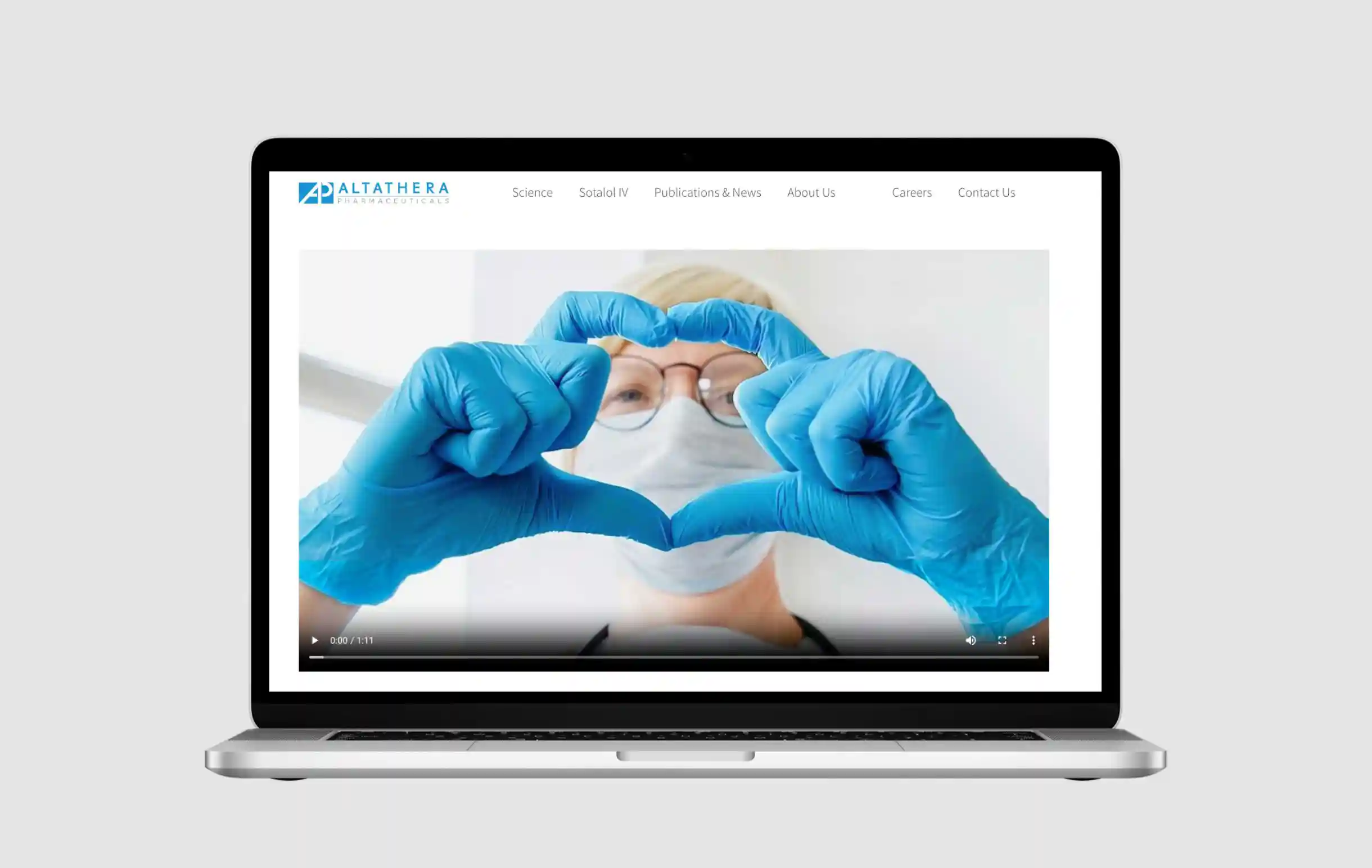
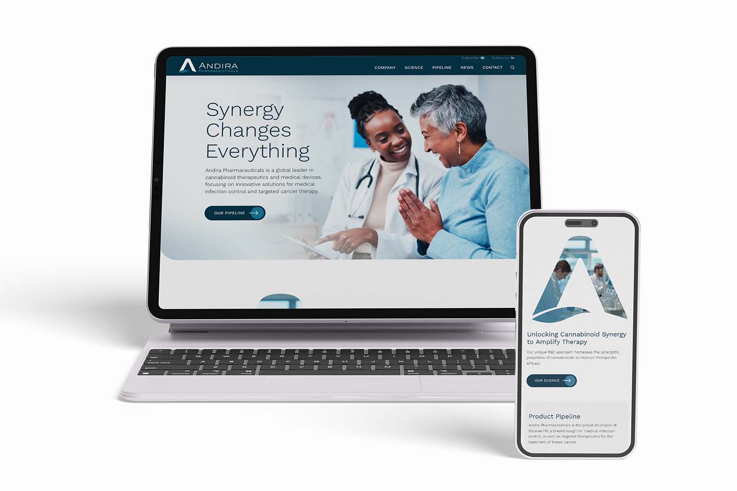
AltaThera Pharmaceutical’s website is clean and simple, with light backgrounds and dark text to maximize contrast for accessibility.
11. Introduce Copy with Short, Accurate Headlines
Headlines set the stage for any biotech webpage. According to Copyblogger, 80 percent of your visitors will read headlines, but only 20 percent of them will read the rest of the article. Google also considers headlines to index pages and for page ranking. Test after test has shown that simply improving your headlines and subheads can significantly decrease the bounce rate and increase conversion rate. Google also uses headlines to index pages.
What does a good headline look like?
Experts generally agree that headlines should be short—five to 10 words, appeal to the primary target audience, be clear and easy to read, reflect page content, use keywords, and be well-ordered for scannability.

12. Tell a Captivating Story
Life sciences concepts, discoveries, innovations, and human-focused results make for great stories that can inspire a wide audience, create an emotional connection with the reader, and pique the imagination of experts and non-experts alike. Like all stories, the impact depends on how you tell the story.
The secret is to bring human-focused meaning to your story and use an approachable writing style. Focus on presenting scientific information in a compelling and engaging way, making complex ideas more accessible and relatable. Methods include using compelling narratives, personal experiences, and success stories—without jargon, still language, or dense copy. Make the story even more engaging with infographics, photography, videos, interactivity, and other ways to engage audiences.
13. Video Backgrounds: Use Them Wisely
Video backgrounds are becoming popular in the evolution of biotech website design trends. We like them, and so do our clients.
SonoThera’s website shows how a moving background can make a company stand out, heighten visual appeal, and keep eyes on the page longer. While these examples are symbolic, video backgrounds can be more literal, such as showing your team working together or a customer using your product.
While this technique is in high demand, it can backfire on you if it’s too distracting, makes it hard to read text positioned on it, increases page load time, performs poorly for people with slow internet speed, drains batteries in mobile devices, or fails to provide a consistent experience across platform, screen size, and resolution.

Here are some tips if you are considering a video background on our biotech website:
- Keep the length to 15-30 seconds, and don’t loop it endlessly
- Ensure high quality, but smaller than 5MB and under 500k
- Mute the video by default, with user-activated controls to enable audio and pause the video
- Avoid distraction caused by too much movement
14. Convey Concepts with Scientific Illustrations
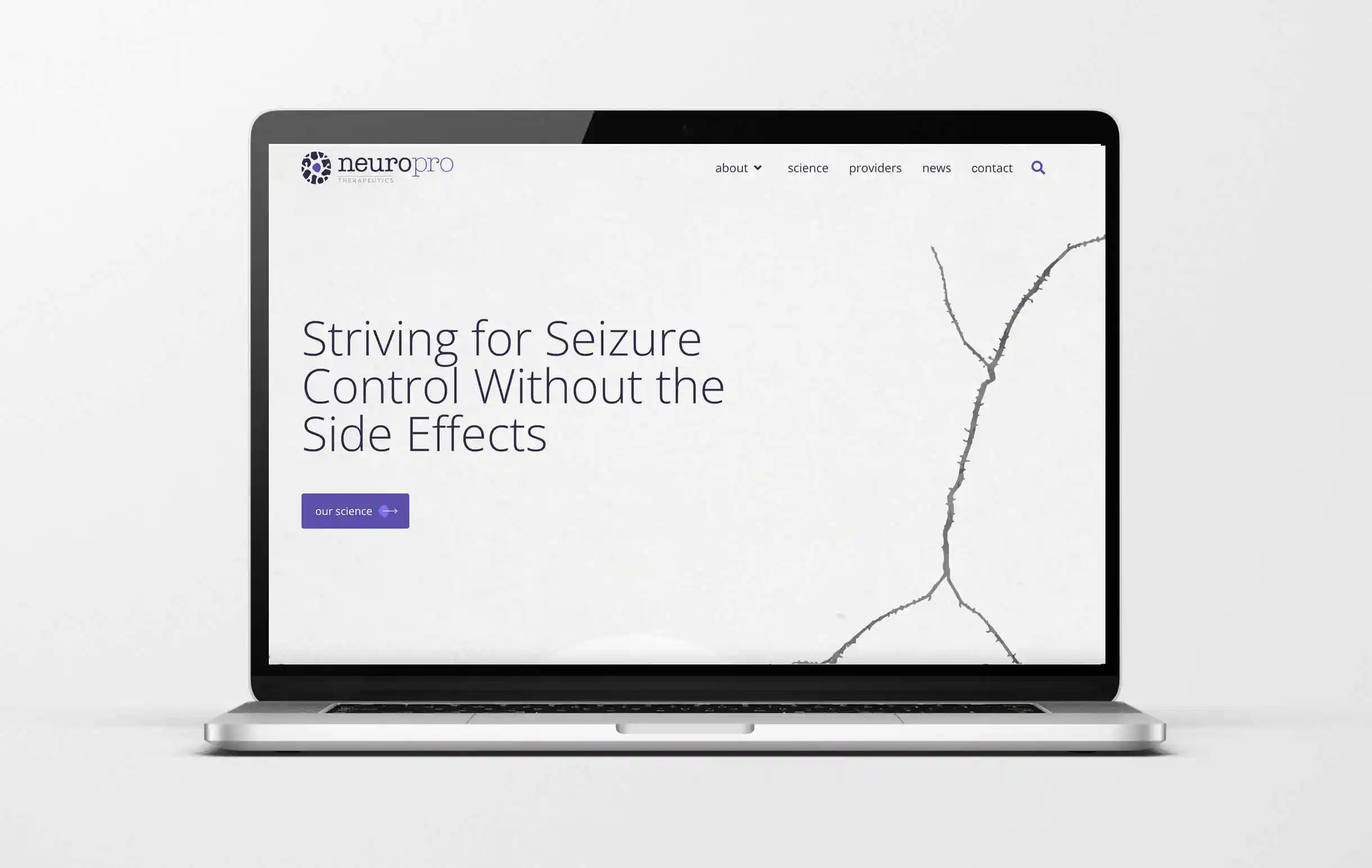
First-rate written content is vital for a biotech website’s success, but it often needs visual support to succinctly and accurately explain complex information and concepts through words alone. These ideas also may not lend themselves to photos or other artwork. Custom illustrations can decrease or remove the need for dense explanatory copy and can align with company branding and website design.
Balance Biotech Website Design Trends with Longevity
You want your website to be modern. However, being too trendy can make it look dated quickly. Hire an agency with a team of biotech design and marketing experts who know how to apply modern web techniques and concepts and ensure that your website looks current for a long time.
To discuss how to find this balance for your biotech website, contact our experts today.
