An independent school in Connecticut celebrates a milestone anniversary with new branding
There’s no better way to move forward than to showcase a private school’s brand to prospective families. That was the plan for an independent school that contacted us to redesign its website for its upcoming milestone anniversary. Its objectives were to highlight the school’s values, excellence, and vibrant personality, with the end goal of increasing enrollment.
Inconsistent Branding Puts Up a Potential Roadblock to a Private School’s Image and Marketing
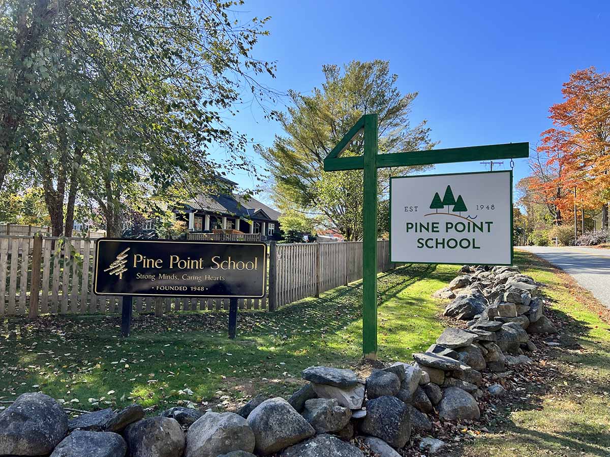
Whether redesigning a website, refreshing it, or building one from scratch, design should reinforce a school’s solid brand image, distinguishing it in the minds of the consumer. However, as the Ladybugz team reviewed the school’s marketing assets at the start of the project, we flagged inconsistencies in how the client presented itself graphically. We saw many logo variations, with different colors, fonts, and at least five versions of its key icon element.
So what’s the problem as long as the logos are mostly the same? The problem is that the brand deteriorates and loses the factor of instant recognition. In layman’s terms, it just looks sloppy—not a good look for an independent school. For example, logos for the athletics program, parent association, and summer enrichment program were all slightly different–and none matched the logo used by the administration office. The programs looked like disconnected “add-ons,” rather than forming a cohesive family under a single umbrella logo.
The School’s Project Shifts from a Website Redesign to a Newly Rebranded Digital Asset.
Now we have an issue. Do we just move forward with the website, or do we suggest charting a different course? Because a unified brand image is essential for good marketing, we proposed expanding the scope of the project to include both rebranding and website redesign. We hoped the school would understand the value of a rebrand, especially as it approached a monumental year of service.
The education client initially hesitated at our suggestion, especially since it would delay the school’s website design project. It would be a significant task given the range of community opinions, history, culture, and emotions behind the school’s ethos.
After much discussion, however, we were given the green light to go ahead with the branding project before designing the independent school’s website.
As a group, the client’s leadership determined that the process of streamlining the brand aligned with their milestone celebration. This expanded focus inspired the community to further explore its self-identity, vision for the future, and how to convey the school to the public in future marketing efforts.
Let’s look at 7 steps to accomplish a successful independent school branding
1. Create a process of inclusion, self-discovery, and understanding.
The secret sauce to successful brand consulting and evolution is to meet clients and their organizations exactly where they are at. Our job starts by listening, asking smart questions, and applying proven processes. We then fuse these findings to create a well-branded image that aligns with the client’s objectives. As with other independent schools, our client’s main marketing goal is to attract parents and ultimately drive them to enroll their children in the school.
2. Include all stakeholders to get buy-in early on.
Design projects can tank without getting early buy-in from stakeholders, decision influencers, and final decision-makers from the start. We were fortunate that collaboration is one of the school’s primary values. They were fully on board with having a broader community discussion about image and branding. With so much enthusiasm, we knew it was important to find a way to encourage participation and feedback from the larger school community.
Ladybugz’s Creative Director and Brand Strategist worked with the client to create an inclusive team that would provide a variety of perspectives. This group included the Head of School, Admissions Leaders, and their Head of Marketing—some of whom were current student parents. For a broader context, we added participation from a task group representing school administration, parents, and teachers.
3. Be Organized by Creating a Process and Setting Expectations.
Now that we laid the groundwork, we need to set some parameters to organize the project and keep communication open. In simplified form, the process consisted of four primary elements:
- Establishing a timeline and setting clear expectations for the process and deliverables
- Pre-scheduling our virtual meetings to ensure ongoing, regular communication
- Designating a key point person on the client’s team as a primary liaison to address issues in between team meetings
- Create a collaborative review and approval process
Our school rebranding plan included a detailed breakdown for each area to streamline the process.
4. Drive the Brand By Defining Its Core Values and Differentiators.
The first phase of the project was Discovery. Our first task was working with the client’s team to uncover information about the school’s origin, brand history, audience groups, competitive landscape, and vision for the future. As part of this discovery process, we interviewed the leadership and then reviewed all their existing marketing assets—including all the logo variations, school collateral materials, student/family testimonials, and their current website.
During discovery, the spirit of “Joyful Learning” emerged again and again as the very essence of the school’s nature. Underlying this broad concept, we found several distinct themes. These included a commitment to Diversity, Equity, Inclusion, and Social Justice (DEIJ); creating a collaborative community; and fostering a caring, supportive community with excellent, personalized learning. Other important elements were the school’s well-established history and its coastal beauty.
These ideals would be reflected in the updated logo, and then extended throughout the look and feel, copy, images, videos, and other strategic elements of the website.
5. Hold a Client Discovery Workshop for the Key Audiences.
In the spirit of collaboration, the Ladybugz and client team met to explore how we could expand participation within the larger school community so that everyone’s voice could be heard. We wanted to put the logo under a microscope, get feedback from different groups about likes and dislikes, and then identify commonalities we could integrate into the refined logo. Feedback would also help determine the larger look and feel for the website and other marketing assets.
6. Conduct First-Hand Research for Independent School Branding.
After brainstorming ideas, we all became excited by the idea of Ladybugz creating a custom survey to get feedback on the most current logo used by the administration. From this survey, we would capture quantitative data points and qualitative feedback.
From the 2,000 surveys sent out, we achieved a 9.5% (190 respondents), which fell within the typical response rate. Some of the results included:
- 48% liked the current logo very much, with 12% either disliking or disliking it very much.
- In particular, 53% love the central element of the pine tree, with 26% liking the tree concept but wanting a different tree design.
- The largest group found the logo very appealing (40%), followed by somewhat appealing (31%).
- 60% felt that the logo fit with the organization either a lot (34%) or a great deal (26%).
As could be expected, there were many differences of opinion, but some points were held in common by most respondents. For example, nearly everyone wanted to continue using a Pine Tree, in some form, as a focal design element. Some respondents wanted to express an imaginative, childlike quality. Others wanted to reinforce the established history of the school.
As we shared the report with the client, we were all encouraged that so many people responded. First, it provided valid data we would apply first to the logo redesign and then the website refresh. The school was also gratified that the survey created excitement, promoted buy-in, and reinforced the sense of community.
7. Collaboration Plus Creativity Equal Strategic Redesign.
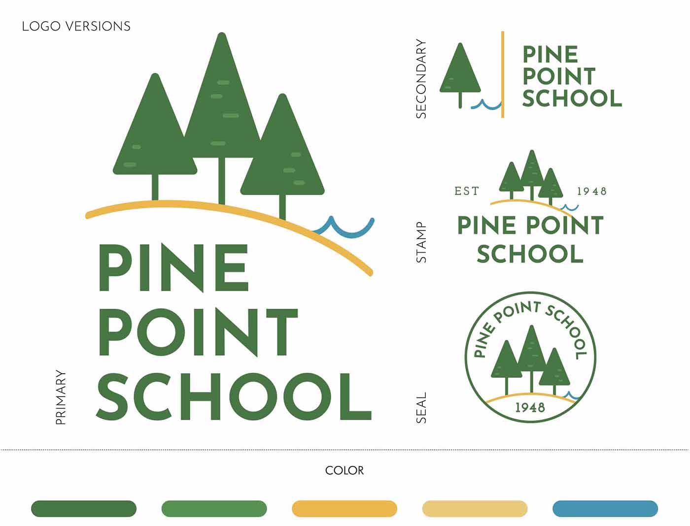
We put our discovery, research, and expertise to work, refining the logo and brand concept. We presented the client with two branding—each included a primary logo, logo family for school sub-brands, sets for the school and its sub-brands, a writing style guide, color palette, and typography palette.
While the client team welcomed both concepts, one resonated immediately, across the board. Once the concept was selected, we all worked together to evaluate the chosen concept, tweaking the fine details to come up with the final independent school branding assets. Given the purposeful, collaborative nature of the process, it’s not surprising that the school loved the end result and wholeheartedly wanted to move forward with the school’s website redesign.
What We Learned About Independent School Branding
Let’s start with a quote for a member of the client’s leadership team:
“We are SO glad we tackled branding first. So much so, I can’t even imagine having done it any other way. Thank you for guiding us through this process.”
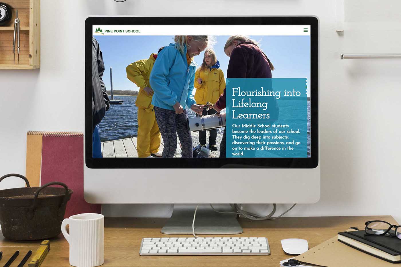
The school now has clarity around the brand identity design and is confident in the website reconstruction. In addition, they are equipped with complementary brand designs and templates that support sub-brands and affiliated school organizations. What a perfect way to commemorate their upcoming 75 th Anniversary!
Our digital agency’s perspective.
This project was a perfect example that an open spirit of collaboration as part of the independent school branding process can lead to the growth of both agency and client. It was extremely satisfying to stretch beyond the limits of web design to a more foundational branding level, elevating the value we provided to the client.
Our digital agency’s combined experience, from strategy to design, proved to be a tremendous asset in aligning a stronger school brand identity with the client’s vision.
