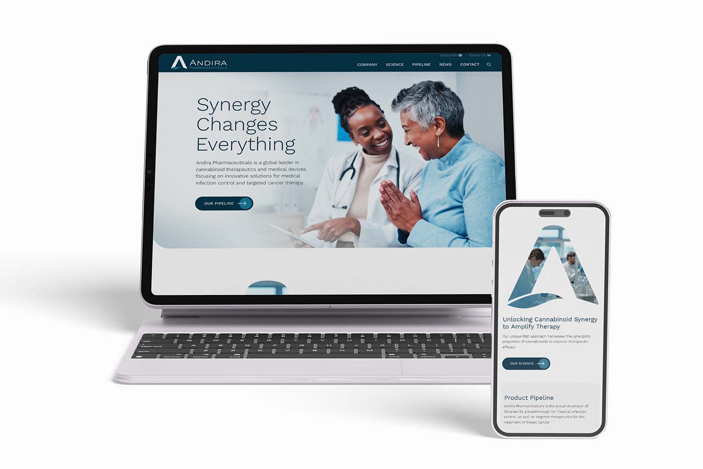
If your website is underperforming, you can transform your homepage from a messy one to a successful one. Its design, content, and navigation are central to your digital identity. Plus, it’s most likely the most visited page on your website. Whether visitors search your company’s name and land directly on your webpage, or whether they navigate to it from an inside page, its importance can’t be overstated.
As your gateway to the rest of your website, your homepage serves several vital functions. Primary among these are:
- Create a Good First Impression: Since you only have 10-20 seconds to capture your reader, the first job is to create a good first impression. Take into account what type of look and content will appeal to your audience’s tastes and expectation.
- Convey Professionalism: Increase your credibility by including only high-quality text and images, with an uncluttered look.
- Introduce Yourself: Set the stage with content and graphics that make your visitors curious about you. Tell them who you are, what you do, your USPs (unique selling propositions), and core offerings.
- Access Valuable Information: Navigation: Use navigation and architecture that makes it easy for visitors to understand what’s in your site and access the information they want.
- Boost SEO: Help search engines understand your site and its context within your niche by using SEO methods.
Create a Top Performing Homepage on your Website: A Mini How To Guide.
Most marketers understand the basic gist and purpose of their website’s homepage, which are outlines above. However, sometimes there’s a missing ingredient that lowers the homepage’s functionality. Not optimizing the homepage every way you can result in bounces, lower session duration, few leads, and fewer customers. Not good! What we’ll focus on here are some of the homepage elements that are often undervalued—but could make a difference in helping you achieve your digital marketing goals and transforming your homepage.
As you refresh, upgrade or create your website’s homepage, make sure to include these items in your planning and implementation process to transform your homepage into something stunning.
1. Optimize for mobile to help transform your homepage.
Google searches on mobile devices are skyrocketing. While percentages vary by industry, the overall statistics are impressive:
- In the United States, 63% of Google’s visits are via a mobile device.
- 80% of users used a mobile device to search the internet in 2019.
- 40% of online transactions are done on a mobile device.
The first essential tip for the user experience (UX) of your mobile visitors is to create a responsive site. This simply means that your website will appear and function properly on all screen sizes. Other key elements for mobile UX include using a larger font for headlines (at least 22-24 points) and at least 16-20 points for body copy. Second, design larger buttons for accurate clicking, especially with the thumb. Third, focus on a simple, uncluttered layout. Finally, test for mobile. This is easily done, often with free tools, such as the Google Mobile-Friendly Tool. If you’re using WordPress, it’s built right into the platform.
- Simplify your copy: Some types of websites, such as B2B sites and those dealing with complex subjects, tend to be copy-heavy, full of charts, and other fancy stuff. Even if the customers in your industry need highly technical and explanatory content, keep your homepage simple. In short, clutter turns people off.
Your homepage isn’t the place to tell your whole story. It’s a place to get readers situated and then entice them to explore what they’re interested in. Keep your primary CTAs to a minimum (see below) and include plenty of white space that is easy on the eyes.
Other tips include using simple, user-friendly language (without jargon or hype) that will make the reader feel comfortable and connected. If you choose to have more, rather than less, copy, include frequent, engaging, and visible subheads to help readers scan the page.
Choosing a New Web Design Agency? Here are the Questions you Need to Ask.
2. Limit your CTAs on your homepage.
Homepages are most successful when they stick to your main message, make readers comfortable with the site, and help them navigate to pages they’re interested in. In a way, your navigation bar is a CTA, encouraging visitors to go one level deeper into the site. Your footer operates similarly. You may have other CTAs to your contact page and blog. That’s already a lot of navigational options.
Too many extra CTAs on your homepage—such as special promotions and downloadable content—distract from these objectives. In most cases, you’ll want to limit your primary CTAs to the one or two that are most aligned with your digital marketing goals. For example, if your marketing thrust for the quarter is a new product launch, it makes sense that you’ll want some type of “learn more” CTA on your homepage.
Probably the most frequent website goal is to generate leads. To transform your homepage, you can include a CTA, which can be an introduction for more lead-generation. But don’t waste this valuable space. Design your CTA to carefully align with marketing objects.
For example, you may have one of these goals:
- High-Quality Leads: If you want to focus on high-quality leads, you might have a CTA going to a landing page for subscription or content marketing offer. Those who convert by provide their email addresses and other personal information will be highly interested, motivated readers. “Tire kickers” will self-select out and not convert.
- More Leads: You main goal may be to build your awareness and credibility. In this case, you want to reach as many people as possible, at all stages of the funnel. Tire-kicker welcomed! This CTA should be low-commitment and not require any personal information from the visitor. Your CTA might be a general ‘Learn More’ or ‘Read My Blog.’
3. Place Your Logo in a visible location.
As your company’s most important branding element, the logo on your homepage should be more prominent than on inside pages, headers, and footers. In addition to branding, when users are on an inside page, clicking on the logo is a common way to get back to the homepage. The most popular placement is the upper left corner, where most visitors start scanning a page. Another popular technique is putting the logo front and center, as the main element in the hero image.
4. Show social proof.
What other people say about your company, products, solutions, and customer service matters—so why not highlight them on your homepage. Add veracity and trust by including one or several positive quotes from customers. If possible, include their name, title, company, and/or photo. Think about including links to case studies, online reviews, and videos of customers singing your praises. You can also convey proof of excellence by mentioning awards, recognitions, and membership in trade associations.
- Remember your contact information: Your ‘Contact Us’ button or CTA should be visible and easily accessible to help transform your homepage. A common placement is the last tab in the main navigation menu. If you want to minimize your menu, another common place is a dropdown under ‘About Us.’ Many companies also put a highly visible clickable phone number or email address in a bar above the navbar or hero image, often in the upper right corner.
- Provide relevant resources: Many of your visitors won’t be in the purchasing mindset at all; they will be researching or educating themselves about a broader topic or product category. This is especially true for complex B2B industries, such as sophisticated technology or finance software. These audiences (as well as search engines) will view a ‘Resources’ tab on your navbar as a sign of credibility and authority. You can include your own content (a survey or white paper), or you can link to outside resources—such as guidebooks, articles, reference materials, and more.
- Create a useful footer: An informational footer serves a similar purpose as your main navigational menu. Similarly, it will appear on all of your website pages and will provide information that users frequently need. Most footers contain the following:
- Company Contact Information
- Social integration
- Mini-site map
- Privacy statement
5. Create SEO-friendly content.
SEO experts have different opinions about how important the homepage is for SEO. Still, your homepage is a digital asset that shouldn’t be ignored in any way, including SEO. Here are some suggestions for homepage SEO elements:
- Basics: A relevant SEO homepage title and metadata
- Navigation: A well-structured menu that points to key internal pages
- Copy: Text that is clear about who you are, what you do, and your USPs.
- Organization: Page organization with logical H1 and H2 headers, with relevant information under each
- Keywords: Long-tailed keyword, rather than a simple keyword to help with organic traffic
- Schema: Organization Schema, also known as structured data, that generates a “brand signal” to search engines; includes your logo, social profile links, and contact information
- Product: Core offerings with relevant links.
Get Ready to Transform your Homepage.
Your visitors’ journey starts with your homepage and it may be seen throughout a user’s time on your site. Work with your interactive design team to align your entire site with your company brand and goals—in a way that satisfies and engages your key audiences. Now that you understand the key elements of your homepage, look for digital experts who can guide you in the right direction.

